Claims of dramatic loss of Great Barrier Reef corals are false
Corals expert hits out at media reports
GWPF | October 15, 2020
Claims that Australia’s Great Barrier Reef has lost half of its coral cover between 1995 and 2017 have received global media coverage.
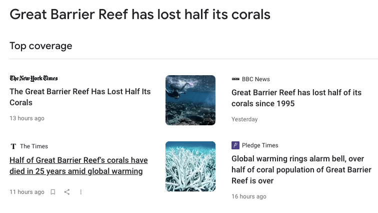
The stories were based on a new paper co-authored by controversial Australian researcher, Professor Terry Hughes of James Cook University.
But according to Professor Peter Ridd, a leading authority on the Great Barrier Reef, these claims are false.
According to Professor Ridd, the best data on coral cover is taken by the Australian Institute of Marine Science (AIMS), who have been measuring over 100 reefs every year since 1986:
“AIMS data shows that coral cover fluctuates dramatically with time but there is roughly the same amount of coral today as in 1995. There was a huge reduction in coral cover in 2011 which was caused by two major cyclones that halved coral cover. Cyclones have always been the major cause of temporary coral loss on the Reef.”

Coral cover of the Great Barrier Reef 1986-2019; AIMS/Peter Ridd 2020
This is not the first time that Professor Hughes has made such claims about coral loss. His previous study was strongly criticised by the AIMS scientists responsible for collecting and publishing the coral data.
Moreover, Professor Hughes has refused to make public the raw data upon which he made this claim, despite repeated requests.
“This latest work by Prof Hughes needs a thorough quality-audit to test its veracity”, says Ridd. “Prime-facie, there are excellent grounds to treat it with great scepticism.”
Contact
Professor Peter Ridd
e: peterridd@yahoo.com.au
New UN Climate Row: Alarming Report Contradicts Its Own Data
By Edwin Timmer, De Telegraaf, 14 October 2020
Amsterdam: The United Nations has become caught up in a new climate row over a recent UN report which claims to show an increase in climate disasters – but which seems to be contradicted by its own data.
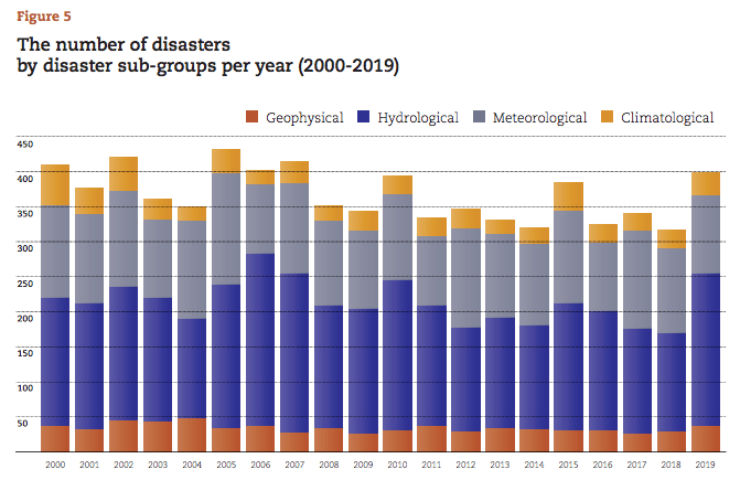
The row was triggered by the new report on “Human Cost of Disasters”. The report announced a “staggering rise in climate-related disasters over the last twenty years”. However, the same report contains a graph showing that the number of climate-related disasters has actually decreased by 15 percent since 2000.
It is not the only contentious element of the report by the United Nations Office for Disaster Risk Reduction (UNDRR) in Geneva. Some of the data used is also said to be unreliable while the alarmist language of Mami Mizutori, Special Representative of the Secretary-General for Disaster Risk Reduction and Head of UNDRR, seems to have been inspired by activist groups like Extinction Rebellion.
Due to the fuss, there is now an international call for at least rectification. “This is a huge, embarrassing blunder,” said Benny Peiser, director of the Global Warming Policy Forum, a British think tank. “The United Nations must immediately withdraw this report and apologise for misleading the public.”
Roger Pielke Jr, a renowned American scientist in the field of natural disasters – and anything but climate denier – also regrets the sharp position by the UNDRR. In an e-mail to De Telegraaf he says that the authors have drawn “flawed conclusions”.
It is not the first time that the UN is accused of climate exaggeration. UNICEF stated last year that hurricane disasters in the Caribbean is driving more and more children to flee. “Pure scare tactics,” said a hurricane expert at the time. And a report by the IPCC once predicted that the Himalayas would be glacier-free by 2035. That also turned out to be a scientific mistake.
However, the UNDRR report substantiates its statement about increasing climate disasters with data from the renowned Belgian Centre for Research on the Epidemiology of Disasters (CRED). Between 1980 and 1999, the Leuven database counted 4,212 disasters and 7,348 from the turn of the century to 2020. Ergo: the climate has gone wild.
“This is clear evidence that in a world where the global average temperature in 2019 was 1.1˚C above the preindustrial period, the impacts are being felt in the increased frequency of extreme weather events including heatwaves, droughts, flooding, winter storms, hurricanes and wildfires.”, according to the report, which also included CRED researcher Joris van Loenhout.
But here too, the report goes wrong, warns Pielke Jr. The data on disasters from the last century are, as the CRED has repeatedly acknowledged, flawed – and therefore unreliable. During the time before the internet existed, not every disaster was reported the way it is now.
British blogger Paul Homewood also discovered a “leap” in the number of disasters the Belgian institute listed which suddenly rose in 1998 — exactly the year the CRED began to receive US funding to start publishing statistics.
The datasets about the two different periods are therefore too different in quality, says Pielke Jr. “You should not draw any conclusions about a changing frequency in climatic extremes on the basis of this data set,” says the researcher at the University of Colorado.
Van Loenhout disputes this criticism. In an e-mail the researcher trained in Utrecht acknowledges that CRED has previously been critical of its own database, but claims that much of the data has been improved recently. Of the dataset dating back to 1900, only the first 60 years may not be reliable, he says. “Disasters will be missing.”
But that is not a problem for the current report, he claims. “From about 1960-1970 onward, the completeness of the data is much greater, and the share of missing disasters much smaller. We are constantly working to improve completeness, and this is also happening for previous years and decades. For this reason, statements made in 2004 and 2006 are now somewhat outdated, as the completeness of the database has since improved,” says Van Loenhout.
Pielke Jr is surprised that, to his knowledge, this is the first time that the Belgian institute is suddenly so convinced of its older data. The American also disagrees with Van Loenhout’s criticism that he should not deduce a downward trend in climate-related disasters over the past 20 years. “Nonsense. Of course you can – it’s the definition of a trend.”
The fierce clash can be explained by the significant deviation of the UNDRR findings with the research studies that Pielke Jr has published. Time and again he has shown that despite an increase in financial damage from natural disasters, there has not been a change in the intensity of most weather extremes. Increasing damage is due to the growth of population, real estate and properties in vulnerable areas.
The UN’s Intergovenmental Panel on Climate Change (IPCC) has confirmed these findings: the near future may bring an increase in floods or hurricanes. But until now this is barely detectable. “Everything I find is consistent with the IPCC,” says Pielke Jr.
One of the most telling trends the American scientist has highlighted is this: the number of fatalities from natural disasters in the past 100 years has fallen by 95 percent — despite a rapidly growing world population. This makes the UNDRR report much more dogmatic about climate trends than its sibling the IPCC, both under the same UN umbrella.
This does not stop UN envoy Mizutori from adopting an alarmist tone. She commends UN staff and volunteers who have saved countless lives in past natural disasters. “But it is being made more and more difficult for them, especially by industrialised countries that are terribly lacking in reducing their greenhouse gas emissions to the level agreed in the Paris Agreement.”
GWPF director Benny Peiser is appalled by this political blame game. As if residents of industrial countries are guilty of future deaths from natural disasters in other countries. “This is no longer science, but a purely political report.”
Translation GWPF
YouTube to remove videos containing Covid-19 vaccine ‘misinformation’
RT | October 14, 2020
Video sharing platform YouTube has said it is banning videos containing misinformation about coronavirus vaccines, in an expansion of the service’s current rules regarding falsehoods and conspiracy theories about the pandemic.
“A Covid-19 vaccine may be imminent, therefore we’re ensuring we have the right policies in place to be able to remove [related] misinformation,” YouTube said in a statement on Wednesday.
Any content featuring claims about Covid-19 vaccines that contradict the consensus from local health authorities or the World Health Organization will now be banned on the Google-owned video platform.
This includes any suggestions that the vaccine “would kill people, cause infertility or involve microchips being implanted in people,” YouTube said.
General discussions in YouTube videos about “broad concerns” over the vaccine would remain on the platform, a spokesman told Reuters.
In February this year, YouTube removed ads on channels that promoted anti-vaccine content, warning that it would prevent future advertising on any videos that endorse those views.
Then in April, YouTube banned conspiracy theories falsely linking Covid-19 to 5G networks. That move was in turn followed by the ban on any coronavirus-related content that “directly contradicts” World Health Organization (WHO) advice and is “medically unsubstantiated.”
Wednesday’s decision to prevent “misinformation” about Covid-19 vaccines came after another social media giant, Facebook, banned anti-vaccine ads and said it would encourage users of the platform to get the flu jab.
Japan Leads the Way: No Vaccine Mandates and No MMR Vaccine = Healthier Children
The Promise of Good Health; Are We Jumping Off the Cliff in the U.S.?
By Kristina Kristen | Children’s Health Defense | April 23, 2019
In the United States, many legislators and public health officials are busy trying to make vaccines de facto compulsory—either by removing parental/personal choice given by existing vaccine exemptions or by imposing undue quarantines and fines on those who do not comply with the Centers for Disease Control and Prevention’s (CDC’s) vaccine edicts. Officials in California are seeking to override medical opinion about fitness for vaccination, while those in New York are mandating the measles-mumps-rubella (MMR) vaccine for 6-12-month-old infants for whom its safety and effectiveness “have not been established.”
American children would be better served if these officials—before imposing questionable and draconian measures—studied child health outcomes in Japan. With a population of 127 million, Japan has the healthiest children and the very highest “healthy life expectancy” in the world—and the least vaccinated children of any developed country. The U.S., in contrast, has the developed world’s most aggressive vaccination schedule in number and timing, starting at pregnancy, at birth and in the first two years of life. Does this make U.S. children healthier? The clear answer is no. The U.S. has the very highest infant mortality rate of all industrialized countries, with more American children dying at birth and in their first year than in any other comparable nation—and more than half of those who survive develop at least one chronic illness. Analysis of real-world infant mortality and health results shows that U.S. vaccine policy does not add up to a win for American children.
Japan and the U.S.; Two Different Vaccine Policies
In 1994, Japan transitioned away from mandated vaccination in public health centers to voluntary vaccination in doctors’ offices, guided by “the concept that it is better that vaccinations are performed by children’s family doctors who are familiar with their health conditions.” The country created two categories of non-compulsory vaccines: “routine” vaccines that the government covers and “strongly recommends” but does not mandate, and additional “voluntary” vaccines, generally paid for out-of-pocket. Unlike in the U.S., Japan has no vaccine requirements for children entering preschool or elementary school.
Japan also banned the MMR vaccine in the same time frame, due to thousands of serious injuries over a four-year period—producing an injury rate of one in 900 children that was “over 2,000 times higher than the expected rate.” It initially offered separate measles and rubella vaccines following its abandonment of the MMR vaccine; Japan now recommends a combined measles-rubella (MR) vaccine for routine use but still shuns the MMR. The mumps vaccine is in the “voluntary” category.
Here are key differences between the Japanese and U.S. vaccine programs:
- Japan has no vaccine mandates, instead recommending vaccines that (as discussed above) are either “routine” (covered by insurance) or “voluntary” (self-pay).
- Japan does not vaccinate newborns with the hepatitis B (HepB) vaccine, unless the mother is hepatitis B positive.
- Japan does not vaccinate pregnant mothers with the tetanus-diphtheria-acellular pertussis (Tdap) vaccine.
- Japan does not give flu shots to pregnant mothers or to six-month-old infants.
- Japan does not give the MMR vaccine, instead recommending an MR vaccine.
- Japan does not require the human papillomavirus (HPV) vaccine.

In contrast, the U.S. vaccine schedule (see Table 1) prescribes routine vaccination during pregnancy, calls for the first HepB vaccine dose within 24 hours of birth—even though 99.9% of pregnant women, upon testing, are hepatitis B negative, and follows up with 20 to 22 vaccine doses in the first year alone. No other developed country administers as many vaccine doses in the first two years of life.
The HepB vaccine injects a newborn with a 250-microgram load of aluminum, a neurotoxic and immune-toxic adjuvant used to provoke an immune response. There are no studies to back up the safety of exposing infants to such high levels of the injected metal. In fact, the Food and Drug Administration’s (FDA’s) upper limit for aluminum in intravenous (IV) fluids for newborns is far lower at five micrograms per kilogram per day (mcg/kg/day)—and even at these levels, researchers have documented the potential for impaired neurologic development. For an average newborn weighing 7.5 pounds, the HepB vaccine has over 15 times more aluminum than the FDA’s upper limit for IV solutions.
Unlike Japan, the U.S. administers flu and Tdap vaccines to pregnant women (during any trimester) and babies receive flu shots at six months of age, continuing every single year thereafter. Manufacturers have never tested the safety of flu shots administered during pregnancy, and the FDA has never formally licensed any vaccines “specifically for use during pregnancy to protect the infant.”
U.S. vaccine proponents claim the U.S. vaccine schedule is similar to schedules in other developed countries, but this claim is inaccurate upon scrutiny. Most other countries do not recommend vaccination during pregnancy, and very few vaccinate on the first day of life. This is important because the number, type and timing of exposure to vaccines can greatly influence their adverse impact on developing fetuses and newborns, who are particularly vulnerable to toxic exposures and early immune activation. Studies show that activation of pregnant women’s immune systems can cause developmental problems in their offspring. Why are pregnant women in the U.S. advised to protect their developing fetuses by avoiding alcohol and mercury-containing tuna fish, but actively prompted to receive immune-activating Tdap and flu vaccines, which still contain mercury (in multi-dose vials) and other untested substances?
Japan initially recommended the HPV vaccine but stopped doing so in 2013 after serious health problems prompted numerous lawsuits. Japanese researchers have since confirmed a temporal relationship between HPV vaccination and recipients’ development of symptoms. U.S. regulators have ignored these and similar reports and not only continue to aggressively promote and even mandate the formerly optional HPV vaccine beginning in preadolescence but are now pushing it in adulthood. The Merck-manufactured HPV vaccine received fast-tracked approval from the FDA despite half of all clinical trial subjects reporting serious medical conditions within seven months.
Best and Worst: Two Different Infant Mortality Results
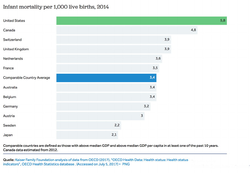
The CDC views infant mortality as one of the most important indicators of a society’s overall health. The agency should take note of Japan’s rate, which, at 2 infant deaths per 1,000 live births, is the second lowest in the world, second only to the Principality of Monaco. In comparison, almost three times as many American infants die (5.8 per 1,000 live births), despite massive per capita spending on health care for children (see Table 2). U.S. infant mortality ranks behind 55 other countries and is worse than the rate in Latvia, Slovakia or Cuba.
To reiterate, the U.S. has the most aggressive vaccine schedule of developed countries (administering the most vaccines the earliest). If vaccines save lives, why are American children “dying at a faster rate, and… dying younger” compared to children in 19 other wealthy countries—translating into a “57 percent greater risk of death before reaching adulthood”? Japanese children, who receive the fewest vaccines—with no government mandates for vaccination—grow up to enjoy “long and vigorous” lives. International infant mortality and health statistics and their correlation to vaccination protocols show results that government and health officials are ignoring at our children’s great peril.
Among the 20 countries with the world’s best infant mortality outcomes, only three countries (Hong Kong, Macau and Singapore) automatically administer the HepB vaccine to all newborns—governed by the rationale that hepatitis B infection is highly endemic in these countries. Most of the other 17 top-ranking countries—including Japan—give the HepB vaccine at birth only if the mother is hepatitis B positive (Table 1). The U.S., with its disgraceful #56 infant mortality ranking, gives the HepB vaccine to all four million babies born annually despite a low incidence of hepatitis B.
Is the U.S. Sacrificing Children’s Health for Profits?
Merck, the MMR vaccine’s manufacturer, is in court over MMR-related fraud. Whistleblowers allege the pharmaceutical giant rigged its efficacy data for the vaccine’s mumps component to ensure its continued market monopoly. The whistleblower evidence has given rise to two separate court cases. In addition, a CDC whistleblower has alleged the MMR vaccine increases autism risks in some children. Others have reported that the potential risk of permanent injury from the MMR vaccine dwarfs the risks of getting measles.
Why do the FDA and CDC continue to endorse the problematic MMR vaccine despite Merck’s implication in fraud over the vaccine’s safety and efficacy? Why do U.S. legislators and government officials not demand a better alternative, as Japan did over two decades ago? Why are U.S. cities and states forcing Merck’s MMR vaccine on American children? Is the U.S. government protecting children, or Merck? Why are U.S. officials ignoring Japan’s exemplary model, which proves that the most measured vaccination program in the industrialized world and “first-class sanitation and levels of nutrition” can produce optimal child health outcomes that are leading the world?
A central tenet of a free and democratic society is the freedom to make informed decisions about medical interventions that carry serious potential risks. This includes the right to be apprised of benefits and risks—and the ability to say no. The Nuremberg Code of ethics established the necessity of informed consent without “any element of force, fraud, deceit, duress, over-reaching, or other ulterior form of constraint or coercion.” Forcing the MMR vaccine, or any other vaccine, on those who are uninformed or who do not consent represents nothing less than medical tyranny.
© 2019 Children’s Health Defense, Inc. This work is reproduced and distributed with the permission of Children’s Health Defense, Inc. Want to learn more from Children’s Health Defense? Sign up for free news and updates from Robert F. Kennedy, Jr. and the Children’s Health Defense. Your donation will help to support us in our efforts.
The Greatest Scientific Fraud Of All Time — Part XXVII
By Francis Menton | Manhattan Contrarian | October 5, 2020
It has been more than a year since I last added a post to this series. The previous post in the series, Part XXVI, appeared on August 20, 2019. For all of the prior twenty-six posts, go to this composite link.
There are two reasons for a new post at this time. The first is that there is some new work out from a guy named Tony Heller. The new work can be found at Heller’s website here, with a date of October 1. Heller also indicates that he intends to continue to add to and supplement this work. Heller is an independent researcher who particularly focuses on the subject of this series: alterations to past officially-reported government climate data to create an impression of warming that did not exist in the data as originally reported. Heller is quite skilled at going through reams of government climate data, and turning those data into useful graphs to demonstrate his points. However, in the past I have sometimes been frustrated with Heller’s work for not including sufficient links to enable a reader to verify that his assertions about data alteration are correct. Thankfully, in the current piece, Heller has corrected that issue, and provides the links so that you can see for yourself that the government has changed the data it previously reported in order to artificially enhance the apparent warming trend.
The second reason for a new post at this time is that President Trump has — finally! — hired two climate skeptics into positions of authority over the bureaucracy that compiles, and later alters, the climate data. On September 12, Trump named David Legates to the position of Deputy Assistant Secretary of Commerce for Observation and Prediction. And on September 21, Trump named Ryan Maue as Chief Scientist at the National Oceanic and Atmospheric Administration (NOAA). NOAA is the main bureaucracy where the principal climate data are compiled, and is a part of the Department of Commerce. (Another agency, NASA, is also involved in these efforts.). Both Legates and Maue have been known as people who refuse to accept much of official climate orthodoxy. It is completely bizarre that these appointments would only occur less than two months before the election that could turn Trump out of office, but there you go.
Heller’s October 1 piece, titled “Alterations To The US Temperature Record,” is one of the most thorough and careful that he has done on this subject. Note that the piece only deals with the temperature records of the US, not the entire world. The temperature records of the US and of the rest of the world present very different issues for researchers trying to assess the accuracy of government-reported warming trends. For the rest of the world, no contemporaneously-generated data exist for most of the surface area and for most of the time period between the late nineteenth century and now. Before the recent years, there just were no (or very few) measurement stations or instruments for vast regions like the oceans, the Southern Hemisphere, Africa, Siberia, and so forth. Therefore, for those and other areas, much of what passes for historical temperature data, particularly from about 1880 to 1960, has actually been created or interpolated after the fact by computer algorithms, which then just so happen to show the trend that the programmers and their bosses would like to see. But for the US, the situation is different. For the entire period back to the late nineteenth century, there has existed a dense network of ground thermometers to record temperatures throughout this country. Therefore, if prior reported data showed cooling trends, and now you want to report a warming trend, that necessarily requires changing prior reported data. Heller:
The US temperature is very important, because the vast majority of stations which NOAA has long-term daily temperature data for are located in the US.
So, have prior officially-reported US temperatures been altered to create and enhance warming trends? The answer is absolutely, clearly, yes. If you haven’t followed this series prior to now, you may be surprised to learn that fact. Remarkably, as Heller points out, NOAA, and its co-bureaucracy NASA, do not deny that they have altered the data, and don’t even make serious efforts to hide the fact. Heller:
Reality is that the data alterations are no secret, and that NOAA and NASA acknowledge that they do it.
It’s not that the alterations are secret, but rather that the bureaucrats make it as difficult as possible to track the alterations, to learn the basis for the alterations, and to figure out what has changed and by how much. Periodically, new versions of data sets are issued, with no detailed documentation of what has changed or on what basis. When NOAA and NASA come out with their latest breathless press release about the “hottest year ever,” and so forth, there is no mention of prior officially-reported data that would contradict the claim. Often earlier data have simply been written over as new, altered data are substituted, making it impossible to track the changes unless you happen to be fortunate enough to have captured a screenshot of the old data before it got modified.
Nevertheless, there are notable examples where the prior data continue to be accessible, and Heller has done some yeoman’s work to compile a number of damning instances. I urge you to read his whole piece, but I’ll give you here what is undoubtedly the most notable and shocking example. In 1999, then NASA/GISS head James Hansen, a noted climate alarmist, came out with a big research paper titled “GISS analysis of surface temperature change.” Heller links to this paper in his piece, and you can see from the url that it is an official NASA document. The paper was part of the then growing climate alarm movement at the time, and contained a collection of claims designed to scare you out of your wits about impending climate change apocalypse. Examples from the abstract:
The rate of temperature change was higher in the past 25 years than at any previous time in the period of instrumental data. The warmth of 1998 was too large and pervasive to be fully accounted for by the recent El Nino. . . .
And so on and on. But Hansen made the mistake of including in the paper a graph of the official NASA temperature data for the US from 1880 to 1999, as it existed at that time. You can find that graph as Exhibit 6 to the 1999 paper. Here it is:

What jumps off the page — and what Heller drives home with his red circles — is that 1934 is the warmest year, approximately 0.6 deg C (or one full degree F) warmer than 1998, which in fact is only the fifth warmest year on this chart, also trailing 1921, 1931, and 1953.
But today NASA has a new chart up on its website, with data through 2019, supposedly generated out of the same data base, but just a new and improved “version” of same. You can go to that link to see NASA’s full chart through 2019, and to verify that this is in fact an official NASA chart. But Heller takes the step of truncating this 2019 chart at 2000 to emphasize the comparison to NASA’s prior chart that went to 1999. Here is the 2019 NASA chart truncated to 2000:

Now 1998 is notably warmer than 1934, and for that matter, also warmer than 1921, 1931 and 1953. The earlier years in the chart have all gotten cooler and the later years all warmer. A declining trend in temperatures from the 1930s to the 1990s has been turned into a warming trend.
How did that happen? What is the basis for the alterations? You will never get that answer out of NOAA or NASA.
Go through Heller’s post to see other examples of earlier and later NASA and NOAA temperature charts, for instance for the state of Texas, or for average daily high temperatures for the full US. Somehow, in each case, cooling trends have been turned into strong warming trends, particularly from the 1930s to 1990s.
And finally, Heller’s pièce de résistance: He calculates the quantitative alterations in the data for each year, and demonstrates that the effect of the alterations is to make the temperature graph match near-perfectly to the changing level of CO2 in the atmosphere. The data have been altered to fit the hypothesis. Heller:
The implication of this is that the huge adjustments being made to the US temperature record are being made to match global warming theory, which is the exact opposite of how science should be done. The unadjusted data shows essentially no correlation between CO2 and temperature.
So, Messrs. Legates and Maue, you now have at least a few months to blow the lid off this scandal. Really, that is all the time it should take. The American people deserve to have an honest accounting of what is going on. Now is our chance.
WHO (Accidentally) Confirms Covid is No More Dangerous Than Flu
By Kit Knightly | OffGuardian | October 8, 2020
The World Health Organization has finally confirmed what we (and many experts and studies) have been saying for months – the coronavirus is no more deadly or dangerous than seasonal flu.
The WHO’s top brass made this announcement during a special session of the WHO’s 34-member executive board on Monday October 5th, it’s just nobody seemed to really understand it.
In fact, they didn’t seem to completely understand it themselves.
At the session, Dr Michael Ryan, the WHO’s Head of Emergencies revealed that they believe roughly 10% of the world has been infected with Sars-Cov-2. This is their “best estimate”, and a huge increase over the number of officially recognised cases (around 35 million).
Dr. Margaret Harris, a WHO spokeswoman, later confirmed the figure, stating it was based on the average results of all the broad seroprevalence studies done around the world.
As much as the WHO were attempting to spin this as a bad thing – Dr Ryan even said it means “the vast majority of the world remains at risk.” – it’s actually good news. And confirms, once more, that the virus is nothing like as deadly as everyone predicted.
The global population is roughly 7.8 billion people, if 10% have been infected that is 780 million cases. The global death toll currently attributed to Sars-Cov-2 infections is 1,061,539.
That’s an infection fatality rate of roughly or 0.14%. Right in line with seasonal flu and the predictions of many experts from all around the world.
0.14% is over 24 times LOWER than the WHO’s “provisional figure” of 3.4% back in March. This figure was used in the models which were used to justify lockdowns and other draconian policies.
In fact, given the over-reporting of alleged Covid deaths, the IFR is likely even lower than 0.14%, and could show Covid to be much less dangerous than flu.
None of the mainstream press picked up on this. Though many outlets reported Dr Ryan’s words, they all attempted to make it a scary headline and spread more panic.
Apparently neither they, nor the WHO, were capable of doing the simple maths that shows us this is good news. And that the Covid sceptics have been right all along.
Featured Video

New positive ivermectin evidence
or go to
Aletho News Archives – Video-Images
From the Archives
Fanatical Followers of the Covid Regime: A Jim Jones-Style Cult?
By Professor Roger Watson and Dr. Niall McCrae | The Daily Sceptic | November 15, 2021
As scholars at leading British universities over recent decades, we witnessed the replacement of critical thinking and debate by narrative: facts are discrimination and scientific method is imperialism; truth, instead, is derived from ‘progressive’ values. This educational trend may be a major contributory factor to the ease in which society has been inculcated to the Covid ‘new normal’ of masking, testing, and repeated doses of vaccines for a disease of similar risk to severe influenza.
One doesn’t need much critical reasoning to observe the flawed logic of some vaccination enthusiasts, such as people who respond to experiencing any side effects, however debilitating, by saying “at least I know it’s working”, or, after contracting the disease despite their promised inoculation (over 90% effective, according to initial drug company claims), “I’d have been worse off without the jab.” … continue
Blog Roll
 Aletho News
- EU Council Advances Chat Control 2.0 Scanning Proposal
- Ex-Greek MEP files complaint against Israeli spyware firm over alleged Pegasus surveillance
- Troubling ideas throughout the Torah, Talmud, Mishneh Torah and Tanya
- ‘Grave, alarming’: Iran mission on Trump’s UNGA ‘annihilation’ threats
- Najaf airport to reopen to Iranian flights within 24 hours: Ambassador
- From ‘How Will This End For Iran’ to ‘When America Walks Away’: A tale of two Economist covers
- Tehran blasts ‘baseless’ speculation linking Iran to alleged bomb plot at UK air base
- The Rise And… Rise Of ‘Color Revolutions’
- The Coming GOP Bloodbath?
- Arctic Scare Stories Melt Away
- If Americans Knew
- An error has occurred; the feed is probably down. Try again later.
- No Tricks Zone
- New Study: Earth And Venus Surface Warmth Largely Explained By Convection And Lapse Rate, Not CO2 Or Radiation
- 2025 Nature Paper Claiming Worsening Global Drought Gets RETRACTED …Heavily Flawed
- New Study: ‘Global Drought Shows No Detectable Recent Acceleration Under Climate Warming’
- Economic Masterminds: German Socialists Suggest Taxing Productivity Gains Stemming From Using AI
- The South China Sea Has Not Been Cooperating With The Climate Change Narrative
- Energy Crisis: Germany Enters Heating Season With Historically Low Gas Reserve Fill Levels
- New Study: The Antarctic Ice Sheet Gained Mass From 2020-2024 Due To Staggering Snow And Ice Accumulation
- Study: Ocean Heating Rates From Thousands Of Years Ago ‘Dwarf’ Modern Ocean Heating Rates
- Climate Extremists Target, Attack Large-Scale Power Grid Infrastructure In Germany!
- New Study: Antarctic Ice Melt Has Contributed Less Than 1 Centimeter To Sea Level Rise In The Last 30 Years


