Why the WHO report on congenital anomalies in Iraq is a disgrace
By Christopher Busby | RT | September 28, 2013
The recently published World Health Organization report on its study of congenital birth anomalies in Iraq is nothing short of a disgrace.
There have been an increasing number of reports about childhood cancers, adult cancers and birth defects in Iraq. Public pressure and media attention to this catastrophic situation prompted a joint study by the World Health Organization (WHO) and the Iraqi Health Ministry to determine the prevalence of birth defects in the country. The study began in May-June 2012 and was completed in early October 2012. But it was not made public until recently. And I have to say that those who designed and carried out the study were well aware that the method they chose could not possibly give correct answers to the question of congenital anomaly rates, since they had consulted with me before they started, and I had pointed out why their method was unsafe, even sending them a report suggesting a method that would work.
In May 2011, I was asked to travel to Geneva by the Union of Arab Jurists to make my first presentation at the UN Human Rights Council, reporting our preliminary findings of extraordinarily high rates of cancer, infant mortality and sex ratio perturbations in the population of Fallujah, which we published in the International Journal of Environment and Public Health in 2010. I met with the director of the Human Rights Council, and also with the director of the International Red Cross, and made the case for intervention.
There was massive anecdotal evidence of these genetic damage effects of the US uranium weapons since the mid-1990s and in Fallujah after the 2004 war, but no one had carried out any study. We collected some money from individuals (about £4,000) and marched in. What we found made headlines in The Daily Telegraph, Le Monde and all over the world. In that study, we examined infant mortality rather than congenital birth defects, for reasons we gave in the paper and I will review here.
Later we also published two other follow-up studies based on hospital data, one analyzing 52 elements in the hair of the parents of children with congenital anomalies, the other giving the congenital anomaly rates and types. Both were based on prospective collection of data by the pediatricians from Fallujah General Hospital, and so we could be sure of the types of anomaly and the numbers.
I have to say that the fear generated by these discoveries made it extremely difficult to get the results published. The Lancet threw the papers out without sending them for review. The International Journal of Environment and Public Health was attacked after the first one, by various individuals they refused to name – and they wouldn’t publish the second one, which was published by Conflict and Health. The third one was also rejected by The Lancet and various other frightened journals and eventually was published by the Journal of the Islamic Medical Association, and then only after I asked them what Allah would think of their pusillanimous behavior. So much for scientific truth.
I pointed out to the WHO representative who contacted me in January 2011, Syed Jaffar Hussein, asking if I would join the WHO project, that the kind of questionnaire study that WHO were proposing would fail for two reasons. The first and most critical is that parents will not have sufficient knowledge to diagnose a congenital anomaly in their baby. For example, in the absence of hospital involvement at a high technical level (e.g. Fallujah Hospital) the baby will just die of what seems to the parents to be pneumonia, or failure to thrive, or the child will die for no apparent reason. In terms of congenital heart defects, or kidney defects, or many neurological defects there is no observable sign. And the type of monstrous defect, the Cyclops eye, the lack of arms, all the pictures on the Internet, these are a minor fraction of all the congenital defects that are fatal at birth. Generally the mother is not allowed to see such a baby and she is told it has died. It is the heart defects that make up the majority, and these are only diagnosable in a hospital pediatric unit.
The second problem I know about, since I have designed and carried out several questionnaire epidemiology studies since the pilot one in Carlingford, Ireland in 2000, is that people can’t remember back even five years, let alone 15 years. And in a situation like Iraq, where having a child with a congenital defect means that you yourself are contaminated and damaged, the likelihood is that you will shortly be dead from cancer and a whole range of illnesses generated by the causes that killed your baby. So the questionnaire study loses cases as you go back in time. The WHO results clearly show this, since the rates they report are actually lower than expected, suggesting that living in Iraq is good for birth outcomes. They seem surprised by this.
So a hospital-based prospective study is the only way. And since this is such a political issue, I said I would only be involved if I could have a hands-on role so that the numbers could be checked, and that was the end of our communication.
The result is very shoddy procedure which would not make it into peer-review. The WHO says that its work and the report was peer-reviewed by senior epidemiologists at the London School of Hygiene and Tropical Medicine, but if this is true these reviewers should be sent packing. The WHO report fails to refer to any of the studies, like our follow-up papers on uranium in Conflict and Health and the IMANA congenital anomaly rates one. There, for example, we looked at the uranium content along long strands of hair in mothers of birth-defect children and showed that the concentrations increased back to the time of the US attacks.

It is fairly easy to show that the WHO results are ridiculous. There was a previous similar study under Saddam’s regime for the period 1994-1999 which is of interest. This study also was not cited in the WHO report but was discussed in our paper which they must have read. The Iraqi child and maternal mortality survey covered 46,956 births in Iraq from 1994-1999. Results were obtained by questionnaires filled out by the mothers and results were given for all children aged 0-4 who died in 1994-1999. Effects found in this period, if due to environmental agents, would, of course, follow exposures in and following the first Gulf War. Using data presented in the tables in this publication it is easy to show that the results indicated a marked increase in deaths in the first year of life with an infant mortality (0-1) rate of 93 per 1,000 live births. Fifty-six percent of deaths in all the children aged 0-5 occurred in the first month after birth, but since the results were from self-reporting, it was difficult to draw conclusions as to the underlying causes of death except in the case of oncology/hematology. For example, the largest reported proportion of deaths in the neonates were listed as “cough/difficulty breathing” which might result from many different underlying causes. The low rates from congenital malformation reported are hardly credible. However, using data published in the report it appeared that the cancer and leukemia death rates in the entire all-Iraq 0-4 group were about three or four times the levels found in Western populations for this age group. These rates were three times higher in the south where depleted uranium was employed in the major tank battles near the Kuwait border (53 per 100,000 per year) than in the north (18 per 100,000 per year) where there was less fighting and where depleted uranium was not employed to such an extent. Furthermore, cancer and leukemia rates were highest in the 0-1 year group, which is unusual; the main peak in childhood cancer is generally found at age 4.
Despite all that can be said about the methodology, it is extremely hard to reconcile the WHO study’s finding of an overall congenital anomaly rate of 23.6 with the rate of 147 we found in Fallujah General Hospital, reported by us in. In Table 2, I copy the full results which were submitted in this congenital anomaly paper. It is clear from this that the majority of conditions could not be recognized by mothers of children who died at or shortly after birth. Of 291 babies with congenital abnormalities in our Fallujah hospital study, 113 were cardiovascular, 40 digestive, 9 genitourinary and 44 chromosomal defects, few of which could be recognized as congenital anomalies by mothers, and would need specialized diagnoses in a top hospital to classify.
It is shown in Table 2 that the rate for congenital heart effects alone is twice the rate reported in the WHO study. Of particular concern is the outcome of the “Expert Peer Group” meeting on 27-28 July, 2013, which apparently endorsed this epidemiologically unsafe approach and its results.
I have written and given presentations on scientific dishonesty. The truth can be established by science, but not if it is dishonest and political. And it seems that this report, and the events and decisions that preceded it, and particularly the London School of Hygiene and Tropical Medicine peer review meeting, are a classical example of scientific dishonesty. The use of the London School of Hygiene and Tropical Medicine reminds me of the use of the Royal Society to produce a disgraceful report on depleted uranium in 2001. Since the outcome is intended to exonerate the US and UK military from what are effectively war crimes, and since the result will be employed to defend the continued use of uranium weapons, all concerned in this chicanery should be put before a criminal court and tried for what they have done. Their actions are responsible for human suffering and death and cannot be forgiven. This is a human rights issue. I returned to the issue of Fallujah when I was invited a second time to make a presentation at the UN Human Rights Council in September 2011. I said then it was time to make a legal stand and I presented the human rights petition I had developed with the International Committee for Nuclear Justice. This issue will be taken forward by the Low Level Radiation Campaign in the next six months, so watch this space.
Finally, we should not forget that the WHO signed an agreement in 1959 with the International Atomic Energy Agency to keep their noses out of any research that has a connection with radiation or radioactivity. This agreement is still in force and is a matter of deep concern.
Christopher Busby is an expert on the health effects of ionizing radiation and Scientific Secretary of the European Committee on Radiation Risk.
National Geographic rising sea level prophecy – cause for concern or absurd fairytale?
By Prof. Don J. Easterbrook | Watts Up With That? | September 25, 2013
The September issue of National Geographic shows sea level midway up the Statue of Liberty, 214 feet above present sea level (Fig. 1) and contains dire images of impending catastrophic sea level rise. Anthony’s excellent responses (http://wattsupwiththat.com/?s=national+geographic) and
(http://wattsupwiththat.com/2010/11/28/freaking-out-about-nyc-sea-level-rise-is-easy-to-do-when-you-dont-pay-attention-to-history/) have demonstrated the utter absurdity of the National Geographic portrayal.

Figure 1. Cover of October issue of National Geographic.
As Anthony points out, at the rate of sea level rise shown by tide gauge records since 1856 at The Battery 1.7 miles away, for sea level to reach that high up the Statue of Liberty would take 23,538 years!
But what about the other assertions in the National Geographic article, such as (1) many graphic images of that the future holds, (2) smaller, but still unreasonable sea level rise, (3) doomed cities (Miami and London gone), (4) flooded coastal areas (most of southern Florida submerged), (5) more frequent storm surge disasters due to sea level rise, and (6) various other catastrophic scenarios? Are any these cause for concern or are they also just unfounded, fear-mongering scenarios aimed at getting attention? Let’s look at some the contentions in the National Geographic scenarios.
1. “By releasing carbon dioxide and other heat-trapping gases into the atmosphere, we have warmed the Earth by more than a full degree Fahrenheit over the past century and raised sea level by about eight inches. Even if we stopped burning all fossil fuels tomorrow, the existing greenhouse gases would continue to warm the Earth for centuries. We have irreversibly committed future generations to a hotter world and rising seas.”
2. “…the big concern for the future is the giant ice sheets in Greenland and Antarctica.” “If the Thwaites Glacier breaks free from its rocky berth, that would liberate enough ice to raise sea level by three meters—nearly ten feet.”
3. “by the time we get to the end of the 21st century, we could see sea-level rise of as much as six feet globally instead of two to three feet. Last year an expert panel convened by the National Oceanic and Atmospheric Administration adopted 6.6 feet (two meters) as its highest of four scenarios for 2100. The U.S. Army Corps of Engineers recommends that planners consider a high scenario of five feet.” “we’re already locked in to at least several feet of sea-level rise, and perhaps several dozens of feet”
4. “Inexorably rising oceans will gradually inundate low-lying areas” “By the next century, if not sooner, large numbers of people will have to abandon coastal areas in Florida and other parts of the world.” “With seas four feet higher than they are today—a distinct possibility by 2100—about two-thirds of southeastern Florida is inundated. The Florida Keys have almost vanished. Miami is an island.”
5. “A profoundly altered planet is what our fossil-fuel-driven civilization is creating, a planet where Sandy-scale flooding will become more common and more destructive for the world’s coastal cities.” “…higher seas will extend the ruinous reach of storm surges. The threat will never go away; it will only worsen. By the end of the century a hundred-year storm surge like Sandy’s might occur every decade or less.”
6. “…carbon dioxide in the atmosphere will reach around a thousand parts per million by the end of the century,” “According to the U.S. Geological Survey, sea level on an iceless Earth would be as much as 216 feet higher than it is today. It might take thousands of years and more than a thousand parts per million to create such a world—but if we burn all the fossil fuels, we will get there.”
7. “by 2070, 150 million people in the world’s large port cities will be at risk from coastal flooding, along with $35 trillion worth of property.”
These 7 statements are not as obviously ridiculous as the depiction of a 216 foot sea level rise at the Statue of Liberty, but all carry ominous consequences if true. Are any of these contentions realistic? Let’s consider real-time scientific data for each of them.
1. Has carbon dioxide warmed the Earth by more 1º F over the past century?
Carbon dioxide is a trace gas that makes up only 0.039% of the atmosphere, accounts for only 3.6% of the greenhouse effect, and has increased by only 0.009% since 1950. By itself, it is incapable of warming the climate by more than a fraction of a degree. With no physical evidence that CO2 causes significant atmospheric warming, the IPCC rely solely on computer models, but because the effect of CO2 is so small, they introduce an increase in water vapor (which is responsible for 95% of greenhouse warming), claiming that as CO2 goes up so does water vapor. For models to be valid, a real-world atmospheric water vapor must go up, but just the opposite is true—water vapor has gone down since 1947 (Fig. 2). Thus, climate models have been an utter failure (Fig. 3)


Figure 2. Declining atmospheric water Figure 3. Failure of climate models to match reality. vapor since 1947. Dark line is average temperature predictions of 44 models; red and blue lines are actual temperatures.
The National Geographic claims that CO2 has caused 1º F of warming this century. But CO2 didn’t begin to rise sharply until after 1945 so cannot have been a factor before then. Temperature data shows that 0.7° C of warming occurred from 1900 to 1945, before CO2 could have been the cause and while CO2 emissions soared from 1945 to 1977, global temperatures declined (just the opposite of what should have occurred if CO2 causes warming), and only 0.5°C warming from 1978 to present coincided with rising CO2 (and that is very likely coincidental).

Figure. 4. Temperature changes during the past century.
Much additional data showing the CO2 is of little significance in global warming is summarized in the Nongovernmental International Panel on Climate Change 2013 report “Climate Change Reconsidered II: Physical Science.” This 1200 page report convincingly and systematically challenges IPCC claims that carbon dioxide is causing “dangerous” global warming and that IPCC computer models can be relied on for future climate forecasts.
Conclusions: National Geographic’s statement that CO2 caused 1º F of global warming this century is contrary to scientific evidence and is thus false.
2. “…the big concern for the future is the giant ice sheets in Greenland and Antarctica.” “If the Thwaites Glacier breaks free from its rocky berth, that would liberate enough ice to raise sea level by three meters—nearly ten feet.”
That this is not going to happen is shown by (1) there is no evidence that this has ever happened in the past and several factors insure that it won’t happen any time soon, (2) Antarctic glaciers are frozen to their base and move by internal flowage of ice, not by basal sliding, (3) these ice sheets lie in basins, and (4) the Greenland ice sheet is behaving just as it has in the geologic past and there is nothing unusual happening to it now.
Conclusion: The likelihood of ice sheets in Greenland and Antarctic sliding into the sea is essentially zero.
3. “by the time we get to the end of the 21st century, we could see sea-level rise of as much as six feet globally instead of two to three feet. Last year an expert panel convened by the National Oceanic and Atmospheric Administration (NOAA) adopted 6.6 feet (two meters) as its highest of four scenarios for 2100. The U.S. Army Corps of Engineers recommends that planners consider a high scenario of five feet.” “we’re already locked in to at least several feet of sea-level rise, and perhaps several dozens of feet.”
How realistic are these predictions of sea level rise of six feet to several dozens of feet? To answer that, all we have to do is look at the sea level rise for the past century and compare it with the National Geographic projection. Sea level has risen 7 inches in the past century at a relatively constant rate of 1.7 mm/yr from 1900 to 2000 (Fig. 5) and has actually shown signs of decline in the past few years (Fig. 6).


Figure 5. Sea level rise of 1.7 mm/yr from 1900 to 2000. Figure 6. Sea level rise since 1993.

Figure 7. Sea level rise over the past century (lower left), sea level rise projected at this rate (black line, lower part of graph), and IPCC predicted sea level rise (red).
The difference between the sea level rise projected from actual rise over the past century and the catastrophic scenario of the National Geographic is 15 times the rate of sea level rise over the past century! Two questions immediately arise: (1) what is going to cause such accelerated sea level rise and (2) where is all the water going to come from? The accelerated rise is based on postulated accelerated warming but there has been no warming in the past 15 years (in fact, the climate has cooled during that time (Figure 8). So no climatic warming means no accelerated sea level rise as postulated by the National Geographic .

Figure 8. Cooling of -0.23°C per century over the past decade. (modified from Monckton, 2013)
In order to get the accelerated sea level rise postulated by National Geographic, much of the Greenland and Antarctic ice sheets would have to melt. However the Antarctic ice cap is growing, not melting, and the Greenland ice cap was about the same size as at present during the Holocene Climatic Optimum. Morner (2011) has pointed out that, even during warming 20 times more intense than recent warming, melting of the massive Pleistocene ice sheets that covered vast areas resulted in sea level rise no greater than one meter per century. Thus, now that these great ice sheets are gone, there is no source of water for sea level rise even approaching one meter, so any prediction of sea level greater than that cannot be considered credible. The National Geographic scenario of the rate of sea level rise of six feet would require a rate of sea level rise of 20 mm/yr. in contrast to the rate of 1.7 mm over the past century.
Conclusion: These data demonstrate that the scenario painted by the National Geographic of very large rise of sea level by 2100 is contrary to all physical scientific data and therefore its credibility must be totally rejected.
4. “Inexorably rising oceans will gradually inundate low-lying areas” “By the next century, if not sooner, large numbers of people will have to abandon coastal areas in Florida and other parts of the world.” “With seas four feet higher than they are today—a distinct possibility by 2100—about two-thirds of southeastern Florida is inundated. The Florida Keys have almost vanished. Miami is an island.”
How credible is submergence of two thirds of Florida by 2100, leaving Miami as an island? Figure 9 shows that sea level rose 7 inches at a constant rate (2.24 mm/yr) during the past century at Key West (which is representative of southern Florida sea level rise). Projection of that rate to 2100 (Fig. 9) would result in a sea level rise of 6 inches by then. Contrast this with the National Geographic projected sea level rise of 21 mm/yr. What could possibly cause such a huge, sudden change in the rate of sea level rise? The answer is that it is not even close to being credible because (1) with no global warming in the past 17 years there is no reason for such a change, (2) there is no source of water–the East Antarctica ice sheet is not melting and Greenland has been warmer for thousands of years in the past without melting its ice sheet, (3) Antarctic sea ice is increasing, setting records, and (4) even during the rapid, intense melting of huge ice sheet at the end of the last Ice Age, sea level didn’t rise this fast. Continuation of sea level at the constant rate of the past century would result only in a sea level rise of about 3-4 inches per generation.

Figure 9. Sea level rise at Key West, Florida from tidal gauge records (Blue curve); sea level rise projected to 2100 at the rate over the past century; sea level rise postulated by National Geographic (red line).
Conclusion: The National Geographic projection that two thirds of Florida will be submerge by 2100 is contrary to data and lacks any possible mechanism to increase sea levels more than a few inches. The National Geographic scenario is therefore totally without any credibility.
5. Are the National Geographic statements “…higher seas will extend the ruinous reach of storm surges.” and “By the end of the century a hundred-year storm surge like Sandy’s might occur every decade or less.” credible?
There is no scientific evidence that storm frequency or intensity has increased over the past century. Figure 10 shows no increase in hurricane power dissipation index since 1900 and the US has experienced the longest period with no hurricanes making landfall (the Sandy storm was not strong enough to be considered a hurricane).

Figure 10. Hurricane index for the US since 1900.
Conclusion: The National Geographic conclusion that higher sea levels “higher seas will extend the ruinous reach of storm surges” is not credible because (1) sea level rise is too small to significantly affect storm surges, and (2) the hurricane strength index is now lower than it was earlier in the century.
6. “by 2070, 150 million people in the world’s large port cities will be at risk from coastal flooding, along with $35 trillion worth of property.”
As shown in the data presented above, none of the National Geographic sea level projections are even remotely believable and sea level projections based on tide gauge records for the past century indicate that sea level will most likely rise 4-6 inches by 2070.
Conclusion: The National Geographic contention that 150 million people and $35 trillion worth of property is nothing more than a fairytale, totally contrary to data that indicates that sea level will rise only a few inches by 2070.
7. “…carbon dioxide in the atmosphere will reach around a thousand parts per million by the end of the century,” “According to the U.S. Geological Survey, sea level on an iceless Earth would be as much as 216 feet higher than it is today. It might take thousands of years and more than a thousand parts per million to create such a world—but if we burn all the fossil fuels, we will get there.”
The National Geographic issue contains many elaborately constructed images under the header of “If all the ice melted,” depicting submergence of extensive coastal areas all over the world and contending that “if we burn all the fossil fuels, we will get there.” What’s wrong with this? For openers, it would require melting of the entire Antarctic ice sheet, the Greenland ice sheet, and all of the world’s ice caps and alpine glaciers. Is this possible? Considering the data presented above, it is, of course ridiculous with no trace of credibility. In addition, the Antarctic ice sheet has not melted in 15 million years, including during many interglacial periods when global temperatures were significantly higher than at present for thousands of years.
Summary of conclusions: From the evidence presented above, the obvious conclusion is that the National Geographic article is an absurd fairytale, completely unsupported by any real scientific data and directly contrary to a mountain of contrary evidence.
Related article
- Has National Geographic Sullied Its Reputation? (dddusmma.wordpress.com)
The coming crisis of climate science?
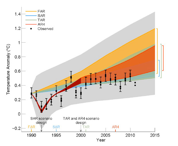
Figure 1.4 from Chapter 1 of a draft of the Fifth Assessment Report from the Intergovernmental Panel on Climate Change. Initials represent the First Assessment Report (FAR) in 1990, the Second (SAR) in 1995. Shaded banks show range of predictions from each of the four climate models used for all four reports since 1990. The last report, AR4, was issued in 2007. The black squares, shown with uncertainty bars, measure the observed average surface temperatures over the same interval. The range of model runs is indicated by the vertical bars. The light grey area above and below is not part of the model prediction ranges.
By Reiner Grundmann | September 19, 2013
With the fifth assessment report soon to be released by the IPCC the pre-publication buzz is well underway. A while ago unauthorised drafts circulated in the blogosphere and now the official leaks have found their way into news editing rooms. A central question picked up by most commentators is the ‘pause in global warming’, the ‘stagnation’, or the ‘hiatus’.
An anomaly presents itself for climate science in that model projections about future temperature increases do not concur with actual temperature observations. As expected, comments align with the agendas of the commentators, depending if one wants to defend the official modelling output or criticise it. These agendas are closely linked to policy options and the question if a lower observed temperature trend provides justification for political action on greenhouse gas emissions.
On this blog Hans von Storch expressed optimism as regards the ability of climate science to deal with this anomaly: ‘Eventually, we need to evaluate the different suggestions, but that will need time. No doubt that the scientific community will achieve this.’ Others are quick to pronounce climate science bunk. David Rose wrote in the Daily Mail ‘A leaked copy of the world’s most authoritative climate study reveals scientific forecasts of imminent doom were drastically wrong.’ Hayley Dixon in The Telegraph put it less blatant but still succinct in her opening sentence: ‘A leaked draft of a report by the UN Intergovernmental Panel on Climate Change is understood to concede that the computer predictions for global warming and the effects of carbon emissions have been proved to be inaccurate.’
Of course, both papers are on the political right and often skeptical about efforts to curb greenhouse gas emissions. It seems as if this topic is inconvenient for the left leaning papers who support action on climate mitigation. The Guardian so far is silent on the issue and prefers to write about new record lows of Arctic Ice coverage. When it looked last at this issue, Fiona Harvey bolstered the heat uptake by the oceans as explanation for the pause in global warming, thus doing away with a potential anomaly. At the same time she claims that climate scientists point out ‘that the trend is still upwards, and that the current temperature rises are well within the expected range.’ A quick glance at the graph above shows this is an illusion (the grey upper and lower bands are not part of the model prediction range).
Both the Mail and Telegraph quote Myles Allen (Oxford University) who tries to put the IPCC and its work into perspective. Says Allen: ‘we need to look very carefully about what the IPCC does in future… It is a complete fantasy to think that you can compile an infallible or approximately infallible report, that is just not how science works. It is not a bible, it is a scientific review, an assessment of the literature. Frankly both sides are seriously confused on how science works – the critics of the IPCC and the environmentalists who credit the IPCC as if it is the gospel.’
The Mail quotes Judy Curry (Georgia Institute of Technology) saying it makes ‘no sense that the IPCC was claiming that its confidence in its forecasts and conclusions has increased. For example, in the new report, the IPCC says it is ‘extremely likely’ – 95 per cent certain – that human influence caused more than half the temperature rises from 1951 to 2010, up from ‘very confident’ – 90 per cent certain – in 2007. Prof Curry said: ‘This is incomprehensible to me’ – adding that the IPCC projections are ‘overconfident’, especially given the report’s admitted areas of doubt.’
Both Allen and Curry call for a radical reform of the IPCC with Curry being more specific: ‘The consensus-seeking process used by the IPCC creates and amplifies biases in the science. It should be abandoned in favour of a more traditional review that presents arguments for and against – which would better support scientific progress, and be more useful for policy makers.’
Meanwhile in the Financial Post, Ross McKitrick wrote: ‘As the gap between models and reality has grown wider, so has the number of mainstream scientists gingerly raising the possibility that climate models may soon need a bit of a re-think. A recent study by some well-known German climate modellers put the probability that models can currently be reconciled with observations at less than 2%, and they said that if we see another five years without a large warming, the probability will drop to zero.’ (this seems to be a reference to the paper by Hans von Storch and Eduardo Zorita recently presented here on Klimazwiebel).
McKitrick goes on: ‘Judging by the drafts circulated this year, [the IPCC] is in full denial mode. Its own figure reveals a discrepancy between models and observations, yet its discussion says something entirely different. On page 9 of Chapter 1 it explains where the numbers come from, it talks about the various challenges faced by models, and then it sums up the graph as follows: “In summary, the globally-averaged surface temperatures are well within the uncertainty range of all previous IPCC projections, and generally are in the middle of the scenario ranges.” Later, in Chapter 9, it states with “very high confidence” that models can correctly simulate global surface temperature trends.’
McKitrick then makes a link between a ‘failed science’ and a ‘costly policy’: ‘since we are on the verge of seeing the emergence of data that could rock the foundations of mainstream climatology, this is obviously no time for entering into costly and permanent climate policy commitments based on failed model forecasts. The real message of the science is: Hold on a bit longer, information is coming soon that could radically change our understanding of this issue.’
This is where the crux of the matter lies. While it is indeed highly problematic to tie costly policies to flawed model forecasts the prospects of climatology are perhaps worth considering.
I chose as title for this blog post ‘The coming Crisis of Climate Science?’ The question mark is intentional and important. It could well be that in the coming year global surface temperatures pick up as expected. Existing models would be vindicated, end of story. The question is: how many more years should climatologists wait for this ‘renormalization’? It appears that mood is shifting towards alternative models and explanations. The timing of the fifth assessment report falls into this critical juncture where a lot of momentum has built up in favour of the current modelling practices which now prove so elusive. While the IPCC tries to make last minute rhetorical adjustments in order to accommodate anomalies, some of its participants, looking beyond, already indicate that this institution may have run its course. But even if the IPCC was reformed or dissolved, we still would have these questions in front of us:
How convincing is the climate science? How important should it be for climate policies? Do we need to implement climate policies, and if so, what should they be?
I can envisage an irony of history where climatology enters a period of crisis and looses its central place in public discourse about climate change, thus opening up discursive spaces for pragmatic options to deal with the problem.
Update: Global mean surface temperatures continued their sideways trajectory for the entire year of 2013 and October 2013 Arctic ice volume increased 50% from October 2012. – (Aletho News)
Related article
Three-Quarters of Members of “Expert” Medical Guideline Panels Have Ties to Drug Industry
By Noel Brinkerhoff | AllGov | August 17, 2013
The vast majority of medical experts in the U.S. who help formulate disease and diagnostic guidelines are taking money from the pharmaceutical industry, according to a new study.
The research published in the journal PLoS Medicine found that 75% of panelists who propose changes in disease definitions and diagnostic criteria had been paid by drug companies either as consultants, advisers or speakers.
Among those serving as chairs of these panels, 12 out of 14 were financially connected to the drug industry.
“Companies with financial relationships with the greatest proportion of panel members were marketing or developing drugs for the same conditions about which those members were making critical judgements,” Ray Moynihan, of Bond University in Robina, Australia, and colleagues wrote.
Examples cited by the researchers included GlaxoSmithKline, which had paid 20 of the 24 members of a 2009 task force that developed new definitions regarding asthma. It just so happens that the company sells the billion-dollar Advair, used to help asthma patients.
Also, Biogen, maker of the multiple sclerosis drug interferon beta-1a (Avonex), had ties to 13 of the 18 participants on a 2010 MS panel that expanded the definition to simplify diagnosis, the study revealed.
To Learn More:
Expanding Disease Definitions in Guidelines and Expert Panel Ties to Industry: A Cross-sectional Study of Common Conditions in the United States (by Raymond N. Moynihan, Georga P. E. Cooke, Jenny A. Doust, Lisa Bero, Suzanne Hill and Paul P. Glasziou, PLoS Medicine)
Pharma Ties Common on Guideline Panels (by David Pittman, MedPage Today)
Experts Related to Drug Makers Promote Narcotics for Seniors in Pain (by Noel Brinkerhoff, AllGov)
Doctors who Earn Hundreds of Thousands of Dollars Speaking for Drug Companies (by David Wallechinsky, AllGov)
Breaking News! Seventh First Climate Refugees Discovered!
By Willis Eschenbach | WUWT | August 9, 2013
Well, my heart fell when I saw the recent BBC article which proudly proclaimed that the people of Kivalina were slated to become “America’s first climate change refugees” …
 Figure 1. The Alaskan native village of Kivalina. SOURCE: BBC
My heart fell for three reasons. First, because once again we are being presented with natural, expected changes in a shifting, unstable barrier island that are falsely claimed to be the result of “climate change”. Folks, barrier islands are just a pile of sand, and they erode, change, and alter their shape with every change in the ocean that built them. As the residents of the barrier islands of the US East Coast regularly discover (although apparently to their infinitely renewed shock and never-lessening total surprise and outrage), when a storm wanders through their neighborhood, the ocean is more than happy to totally reshape any barrier island at any time. The ocean thinks nothing of cutting a barrier island in two, it’s an everyday occurrence around the planet. And the ocean particularly messes with a location like Kivalina, which as you can see from the article is right at the main channel … where all of the water goes through with every tide, where runoff from a huge storm has to force its way out to the ocean, and where as a result the erosive forces are both the strongest and the most unpredictable.
Second, I was bummed that they’d built such a joke of a seawall, because as the photo clearly shows and the article mentions, the seawall there is having unexpected effects which are not all beneficial. As is common with such amateur attempts to tame the sea, it’s building up sand at one end and being eaten away and undermined at the other. No surprise there, except that this was the Army Corps of Engineers and it was built in 2008 … as I discuss below, they are way, way behind the times if that’s their idea of how to protect Kivalina.
The third reason I was saddened was that I immediately suspected the fine hand of some melanin-deficient historical BIA (Bureau of Indian Affairs) official in the original location of the village. The BIA has been the cause of huge grief for just about all of the people under its jurisdiction, so why not Kivalina? Plus, I doubted greatly that any group of nomadic northern hunters would choose to live right there, they’re generally much smarter than that.
When you look at the location of Kivalina on Google Earth, you have to say, what on earth were the BIA thinking? Never mind, they weren’t.
 Figure 2. Overview of the entire island on which Kivalina is located, in the winter, with ice on the ocean. Note the sediment being discharged out the channel by Kivalina, and the areas of reduced ice outside both channels through the barrier islands.
In my previous post on this subject, aptly titled the “Sixth First Climate Refugees“, it was pointed out that the Fifth First Climate Refugees in the Alaskan village of Shishmaref was located on a barrier island because they’d been moved to that spot by the US government. Years ago, there was a big push to stop the traditional residents from being nomads. Nomads drive governments nuts, you can’t control them. So the government very foolishly insisted the people settle in a terrible location, the barrier island where the town of Shishmaref is now located. Now, nomadic traditional people are far from stupid. You can assume that they were all too familiar with the fragility and changeability of barrier islands, because they only put temporary hunting camps on such islands, and wisely lived on the mainland behind the protection that such barrier islands until they were forced offshore. And the same forced resettlement was the story for the Sixth First Climate Refugees, those in Newtok, Alaska.
So when I saw the picture above, my first thought was, “BIA strikes again”. And sadly, my guess was right. The NANA, the Alaska Native Corporation of the northern peoples, tells the story of Kivalina on their web site:
HISTORY
For more than 1,500 years, the barrier reef where Kivalina is located has been a stopping-off place for seasonal travelers between the Arctic coastal areas and the Kotzebue Sound region. In 2009 human remains and artifacts were discovered near Kivalina representing the Ipiutak, a non-whaling Eskimo culture that was present in northwestern Alaska from the 2nd to 6th centuries A.D. The Ipiutak people inhabited the coastal region only in the spring and summer months, moving inland for the rest of the year.
According to elder knowledge, the original permanent settlement known as Kivalina was located on the coast of the mainland, a few miles north of Kivalliik Channel. The people of Kivalina, like the Ipiutak before them, utilized the barrier reef only as seasonal hunting grounds, making camp there in warm-weather months.The first recorded history of Kivalina occurred in 1847 when a Russian naval officer mistook a seasonal hunting camp at the north end of Kivalina Lagoon—a few miles from the location of modern-day Kivalina—as a permanent settlement, the name of which he logged as “Kivualinagmut.”
From 1896 to 1902, United States federal programs transported reindeer to the Kivalina area and funded the training of some residents as reindeer herders.
Kivalina was relocated to its current location in 1905 when the Bureau of Indian Affairs repeated the error of the Russian naval officer by mistaking a seasonal camp on the barrier reef for a year-round village. The BIA in short order built a school on the southern tip of the island and declared that any inhabitants of the barrier reef and surrounding region who did not enroll their children would be imprisoned. This order compelled the people of the original Kivalina as well as communities inland and north and south along the coast to migrate to the Kivalina created by the BIA.
Like I figured, the locals were far too smart to build permanent villages on a barrier island. They “utilized the barrier reef only as seasonal hunting grounds“. So the village is in such a dangerous, shifting location because white guys with guns threatened to throw anyone who didn’t move there in jail … charming.
Now, in response to the predictable erosion and change in the barrier island, the inhabitants of Kivalina sued ExxonMobil, claiming that CO2 was the cause of their problems … and wisely the Supreme Court threw it out.
The fact remains, however, that just as with Shishmaref and Newtok, the cause of the problems are human actions, although they have nothing to do with CO2. All three villages are in ridiculously unstable, shifting, dangerous locations for the same reason—they were rounded up by the BIA and forced to settle there.
So if I came from one of those villages, I’d want to bring suit as well … but I’d want to bring suit against the Bureau of Indian Affairs. Of course, I assume that in the usual Catch-22 fashion, you can’t do that, because the Feds are immune to most suits … grrr. I can see why the Kivalina folks are upset. I’m just afraid that they don’t have a lot of choices, and as a result they sued the wrong folks.
There is one possibility, however. Modern coastal engineering has progressed since the “just build a vertical wall” style of attempted protection represented in the picture above. The modern practice is to use cement-filled tubes of geotextile fabric that run perpendicular to the beach along the bottom of the ocean. These don’t attempt to stop the ocean, like the vertical seawall pictured above. Here’s the challenge.
Anyone wanting to change the shape of a barrier island first needs to realize that the lovely sand beach is not a solid object. It is a river of sand. Sand is constantly being picked up and moved by each and every wave, either up or down the beach. Now, if you put in a vertical seawall like the one shown in the picture, when the waves hit the seawall their energy is not dispersed. Instead, the energy is reflected down the beach. You can see the outcome in Figure 1.
First, note that in the more distant section of the island just beyond the far end of the seawall, the beach is much wider than after the start of the seawall. For the reason, look at the direction that the waves are striking. The problem is that instead of the wave energy being absorbed by the beach, it is being reflected to run parallel the seawall as a long-shore current. You can see how over time this long-shore current has scoured away the sand from the far end of the seawall, and it has deposited it at the near end.
And eventually, the seawall will be undercut entirely, because a vertical seawall also directs some of the wave energy straight downwards at the base of the wall. This scours the sand out directly under the seawall itself, and will eventually lead to its destruction and collapse. The people up in Shishmaref the Fourth First Climate Refugees, have exactly the same problem. There, a poorly designed seawall has shifted the wave energy to where it’s now eating away the town itself. Seawalls just move the wave energy parallel to the coast.
With the modern practice, however, no such vertical seawall is built. Here’s a picture of such an installation, just after construction:
 Figure 3. Three concrete-filled tubes of geotextile fabric, two directly on the sand, and a third one on top of those two.
Note that instead of going along the shoreline, the concrete-filled tubes go perpendicular to the beach, straight offshore into deeper water. Now, remember that a beach is essentially a river of sand. Here’s the important fact—the amount of sand that can be picked up by the water depends entirely on the speed of the water. Fast-moving water can carry more sand than slow-moving water.
So as a corollary of that, if you can slow down the water that is moving the river of sand along parallel to the shore, it will drop its load of sand, and your beach will fill in and stabilize further out into the ocean. And that’s what the tubes full of concrete do. They don’t try to stop the water. They just slow it down a bit, as though the water stubs its toe whenever it goes over one of these tubes. When it slows, it drops its sand, filling in the area in between parallel tubes. A year or so after the picture above was taken, the concrete-filled tubes you see were totally buried in the sand, and the beach extended out well beyond the point of land. Counter-intuitive in a way, because there’s no seawall parallel to the coast at all … but it works like a champ, because it works with nature, not against it like a vertical seawall tries to do. Here’s a before-and-after picture of a larger project:

Figure 4. The waves were undercutting the bluffs, threatening the highway running along the top of the cliff. The system shown in Figure 3 was used all along the coastline. You can see parts of a couple of the concrete-filled tubes perpendicular to the land near the foot of the bluff at the lower right in the second picture.
So while the existing seawall is failing, that doesn’t mean that the folks in Kivalina are out of options. Here’s the link to a main company doing this type of installation, Holmberg Technologies. The pictures above are from their website. (I have no connection with them.) If I lived in Kivalina, I’d get all my ducks in a row tomorrow, and I’d have Holmberg’s on the phone tomorrow. I’d pitch it as Holmberg’s chance to a) get some great publicity, and b) to help to right a historical wrong. The Native Corporation might even be such that Holmberg could get a tax write-off for any contributions, I’d investigate that first. Then I’d call Holmbergs, and offer that the village would provide all the labor, and pay for the concrete, if Holmberg would do the coastal engineering and provide the special geotextile fabric tubes and oversee the project. I’d offer to put their name up all over the project, and mention them prominently in all of the publicity. Can’t hurt to ask … and if they say yes, then I’d hit up the nearest concrete company to provide the concrete as a donation for the same reason. Hey, why not? Could happen. You often don’t get what you ask for, I know that … but it’s rare to get something you don’t ask for, so it’s sure worth a few phone calls. Even if Holmberg says no, I’d get an estimate from them and a plan, asking them for their best possible rates for the reasons stated above, publicity and righting a wrong. Then I’d go out and raise the money, somewhere, somehow, to hire them to do it. See if Crowley Marine or another tug company might contribute towards barging the materials there. Looking at the beach in Figure 4, you can see that by Holmberg’s standards Kivalina would be a fairly small project … just in the middle of nowhere.
Now, the best option is still for the village to move, because no matter what they do to their island, it’s still just a bog-standard barrier island, which means a shifting pile of sand in an incredibly powerful ocean. There are no guarantees in that situation, even with the best coastal engineering advice on the planet.
For example, note in Figure 2 that at the ends of the island where Kivalina is located, both of the channels are located directly across from the main river outlet on the mainland. This is a common situation with barrier islands. Gaps in the islands across from the main rivers allow flood waters running of the land to go straight out to sea.
Now, look at all of the abandoned channels in the mainland … and consider that in the past those have been the main channel, and could be again. Not “if” but when that happens, it will likely cut through or greatly change Kivalina’s island. So staying is problematic in the long term.
But given the cost of moving the village all at once, If I Ran The Zoo I think what I’d do is first hustle up the donations and the $ to install the new concrete-filled tubes to build up the protective beach on the seaside of Kivalina. That will buy some time. Then I’d pick a good spot for the village on the mainland, maybe even the spot of the ancestral village if that’s a possibility. I’d do all of the necessary local ceremonies to bless the choice, get everyone involved so it’s a true community grassroots decision. I’d divide it up into lots based on what the locals say is fair, plenty of different ways to do that, and offer them to the villagers to move to. There’s got to be better land owned by the tribe or controlled by the BIA somewhere in the area. And that way, over the next decades the population could slowly shift to their new homes, without an immediate costs of millions of dollars.
But all in all, there’s no real good answer. Tragically, it’s more of the usual kind of pain and suffering that trails the actions of the BIA like a bad smell. They have been highly corrupt and totally inefficient since their inception. They’ve screwed their “wards” out of millions and millions of dollars. They’ve taken children from their parents and forced them to stop speaking their native languages. The list of their misdeeds is very long, broken treaties and false promises and government obfuscation and embezzlement at each new page in their sordid history. Every Indian or Eskimo I’ve ever known has said that the Bureau of Indian Affairs is nothing but a nest of crooks and thieves, and in my reading I’ve never found anything to contradict that in the slightest …
Anyhow, that’s the story of the Seventh First Climate Refugees. Turns out that they aren’t climate refugees at all, they are BIA refugees. Just another in a long parade of Alaskan and other tribes who have been shafted by the BIA, forcibly settled in a totally unsuitable location, and as a result left with few good options.
Best regards to all, and as a melanin-deficient person myself, other than my poor ideas about fixing the situation, all I have to offer to the good people of Kivalina are my apologies for the historical actions of people who looked like me, and my sincere wishes for success.
PS—BBC, your climate reporting is pathetic. Doesn’t anyone there think to check up on some dewy-eyed reporter gushing on about the tragic fate of the latest batch of pseudo-refugees? Missing the facts in this story would have been understandable a decade ago, but in 2013, you guys are a running joke. Something on the order of …
How many BBC climate editors does it take to change a light bulb?
No one knows, it appears their lights went out years ago and haven’t been replaced since …
Related articles
- PHOTOS: The Disappearing Village (huffingtonpost.com)
- The Inhabitants of Kivalina are the First US Climate Change Refugees (strangesounds.org)
- America’s first climate refugees (thedailystar.net)
- Alaskan Village Underwater In a Decade: America’s First Climate Change Refugees (PHOTOS/VIDEO) (hngn.com)
- Kivalina: America’s first climate change refugees: Hundreds forced to flee their Alaskan village before it disappears underwater within a decade (thisismoney.co.uk)
- Kivalina: America’s first climate change refugees: Hundreds forced to flee their Alaskan village before it disappears underwater within a decade (dailymail.co.uk)
- What is Climate Justice? (triplepundit.com)
- This Tiny Alaskan Village Will Be Underwater In Just 10 Years (fastcoexist.com)
NASA’s climate “tipping point” fails to materialize
2008 NASA scare mongering which was disseminated by Voice of America (now deleted from VOA archives):
Actual 2013 summer arctic ice cover returns to normal:

Featured Video

The American Retreat from Vietnam
or go to
Aletho News Archives – Video-Images
From the Archives
Iran UN ambassador calls for destruction of all nuclear weapons

Iran’s ambassador to the UN Gholamali Khoshroo
Press TV – March 29, 2017
Iran’s ambassador to the UN Gholamali Khoshroo has called for the total eradication of nuclear weapons.
Khoshroo reiterated Iran’s call during a UN conference aimed at creating a nuclear weapons ban treaty in New York on Tuesday.
“Iran, as a victim of chemical weapons, strongly feels the danger posed by the existence of weapons of mass destruction and is determined to engage actively in international diplomatic efforts to save humanity from the menace of nuclear weapons,” he said.
Khoshroo stressed that Iran is committed to its Non-Proliferation Treaty (NPT) obligations, which include negotiations based on effective nuclear disarmament measures.
He added that several countries continue to ignore international calls and treaties for nuclear disarmament and even continue to increase their nuclear stockpiles. “They do not have political determination to abandon doctrines of nuclear deterrence and nuclear terror,” he went on to say.
Iran’s UN ambassador noted that boycotting the talks by many countries, including the US, shows that the world’s nuclear powers are by no means committed to the eradication of nuclear arms. Britain and France were also among the some 40 countries that did not join the talks.
“We note that prohibition of nuclear weapons must be accompanied by the elimination of such weapons. There can be no doubt that without complete abolition of nuclear weapons, there will be no absolute guarantee against the danger of nuclear war and the use of such weapons,” Khoshroo added.
Blog Roll
 Aletho News
- Documents Suggest Fauci Knew COVID Was Created in Wuhan Lab, and mRNA Vaccines Wouldn’t Work
- No return to pre-war status for Strait of Hormuz – Iran’s top diplomat
- Ex-South Korean President sentenced for trying to provoke conflict with Pyongyang
- US publishes docs on ‘dangerous’ Ukrainian biolabs
- Trump’s ERAM cruise missiles for Ukraine blow up his peace overtures to Russia
- EU state lifts arms embargo on Israel after spy scandal
- French watchdog reveals Israeli propaganda firm meddled in New York, Scottish, African elections
- Trump State Department Moves to Deport Trita Parsi
- UK judge brands Palestine Action activists ‘terrorists’ for storming Israeli weapons company
- Report: US military building new base near Gaza border to support post-war plan
- If Americans Knew
- The Issue of Israel Is Ending Democracy In Michigan
- Israel is stealing homes, livelihoods, and lives in West Bank
- Gaza is not an aberration – Israel planned this genocide decades ago
- Israel is changing the face of Lebanon, mainstream media is normalizing it – 3 articles
- Genocide lobby benefits from EU anti-racist fund
- Watching the World Cup from Gaza
- Israel to Blame for 56% of 22,600+ Civilians Killed by Explosive Weapons Globally Last Year
- Tucker Carlson and John Mearsheimer on Gaza, Ukraine, Iran, Russia & a Potential Nuclear Strike
- 88 attacks against Palestinian Christians recorded since start of year
- US administration investigating Iran war critic Trita Parsi, says report
- No Tricks Zone
- New Study: Significant CO2 Fluxes From Non-Volcanic Sources Are Largely Neglected In Carbon Budgets
- Women Climate Scientists Being Harassed, Insulted By Skeptics, Claims Berkeley Earth Researcher
- Germany’s Longterm Spring Climate Data Show “No Climate Trend”
- New Study: Solar Photovoltaic, Wind Power Fail To Meet Annual Energy Demands 62% Of The Time
- Germany’s Die Welt: “Too Much Is Too Much” … Green Energies Are Cannabalizing Each Other!
- Germany’s Ecological Holocaust… Once Fairy Tale Forests Getting Cleared For Wind Turbines
- A Grand Solar Minimum Has Arrived…Global Cooling Of At Least 1°C Is Expected By The 2030s, 2040s
- European “Expert Commission” Urges COVID-19-Like Global Climate State Of Energency!
- Real-World Observations Do Not Support The Position That Climate Change Is Human-Caused
- Germany’s AfD Party Calls Debunked Climate Scenarios “Greatest Fraud In Human History”
