Was 2023 REALLY the second hottest year since 1884?
By Iain Davis | OffGuardian | January 14, 2024
According to the UK Met Office, 2023 was the second hottest year in the UK since 1884.
Quite obviously, this is complete nonsense. Unless they are troglodytes that never venture out in daylight, why would anyone in the UK believe such absurd drivel?
The Met Office states:
2023 is provisionally the second warmest year for the UK according to mean temperature. [. . .] 2023’s provisional mean temperature of 9.97°C puts it just behind 2022’s figure of 10.03°C and ahead of 2014’s 9.88°C.
Right, it’s “provisional” drivel.
The UK summer of 2023—where I live—was a thoroughly miserable affair. We had a few weeks of decent sunshine in the spring and a couple of hot weeks of Indian summer. That was it!
The rest of it was cold, wet and comprehensively devoid of anything we might traditionally call “summer.” The winter preceding and following it wasn’t particularly cold, but nor was it unusually warm.
I’m knocking on a bit and can remember about 50 years of my life. I know, for a fact, that I have lived through many warmer years. Sure, this is anecdotal, but I haven’t completely taken leave of my senses and I still have a functioning memory. No way am I unquestioningly buying the Met Office’s silly claim.
Neither do I believe any of the legacy media reports trying to convince me that the Met Office’s preposterous assertion is evidence of an alleged climate crisis. It simply isn’t true, so it is not “evidence” of anything at all. Although it does suggest deception.
The Met Office—obviously unreliably—tells us “UK mean temperatures have been shifting over the decades as a result of human-induced climate change. [. . .] 2023’s provisional mean temperature of 9.97°C puts it just behind 2022’s figure of 10.03°C.”
For a start, “human induced climate change,” or Anthropogenic Global Warming (AGW), is a questionable and unproven scientific theory, not scientific fact. This too is just another claim from the Met Office which it wrongly asserts as fact.
The Met Office also tells us that “sunshine was near-average for much of the UK.” If we have got this right, the Met Office is claiming that, with average hours of UK sunshine in 2023—which also seems pretty dubious to me—somehow, since 1884, the only year that has been “hotter” was 2022. Which doesn’t ring true either.
What’s going on?
What does the Met Office mean—pardon the pun—by “mean temperature”? It reports that its 2023 alleged “provisional mean temperature of 9.97°C” had been obtained via the HadUK-Grid data set. The Met Office also cites its 2023 rapid attribution study. It is from this that we can—eventually—glean how the “UK mean temperature” is calculated by the Met Office.
In its rapid attribution study, the Met Office states:
Observed values of the UK annual mean temperature are obtained from the HadUK-Grid dataset v1.2.0.0. The time series spans 1884 – 2023, with the 2023 values being provisional as of 2nd January 2024.
“Observed,” that’s what we want to hear. So what observations are reported in the HadUK-Grid dataset? The Met Office claims:
HadUK-Grid is a collection of gridded climate variables derived from the network of UK land surface observations.
If we look at the HadUK-Grid methodology, the Met Office adds:
The gridded data sets are based on the archive of UK weather observations held at the Met Office.
So far so good. The HadUK-Grid reportedly records real data, such as sunshine hours, rainfall and even temperature. We live in hope. Unfortunately, there are some caveats. The Met Office continues:
The methods used to generate the daily grids are described in more detail in [this] report.
OK. So beyond just recording real-world data, what are the “methods” outlined in said report?
[. . .] the Met Office climate data archive [. . .] contains a simplified version of the raw observations generated according to well-defined rules. [. . .] Mean temperature [. . .] is the average of the maximum and minimum temperatures.
At last we have a definition of the “mean temperature” the Met Office claims to be the second highest since 1884. Apparently, it is “generated according to well-defined rules.”
In Met Office speak “mean temperature” isn’t the actual arithmetic mean of daily temperatures but rather the “average” of minimum and maximum temperatures recorded between 09:00 and 21:00 on any given day. Begging the question how are the minimum and maximum UK temperatures “observed”?
Although the data ha[s] undergone some quality checking, the extent and effectiveness of this has changed through time since the 1960’s. [. . .] NCIC climate data analysis software was again used to create the gridded data. [. . .] The station data were normalised with respect to the monthly 1km x 1km gridded 1961-1990 climate normals described by Perry and Hollis (2005a).
So the minimum and maximum allegedly “observed” 2023 “mean UK temperature” wasn’t actually observed at all. It was calculated from normalised data using computers running software based upon the “climate normals” defined in Perry and Hollis (2005).
The related paper considered how to calculate long term averages (LTAs) and suggested a methodology by which “mean” temperatures could be calculated:
For air temperature, 1490 stations reported at some point between 1961 and 2000 but only an average of 560 of these were open at any one time. This gives an array which is 38% complete. [. . .] [T]he solution is to fill in the gaps using an appropriate estimation technique. [. . .] Once the gaps in the array have been filled, long term averages for the periods 1961-1990, 1971-2000 and 1991-2000 can be calculated for each station from the complete array. [. . .] The regression model parameters provide an estimation of [. . .] the UK climate, explaining between 29% and 94% of the variance in the data depending on the climate variable.
Potentially, up to 62% of the data forming the Met Office’s “Mean UK temperature” is “generated” by “fill[ing] in the gaps.” This is based upon an “estimation technique” which supposedly explains between “29% and 94% of the variance in the data depending on the climate variable.” This doesn’t mean that the estimated fill-ins are inaccurate but they cannot be called “observations” either.
We seem to be moving further away from empirical science. Surely the Met Office isn’t claiming that it knows what the average UK “provisional” mean temperature was in 2023 based upon such limited observations? With regard to how it interprets the HadUK-Grid dataset the Met Office states:
The HadUK-Grid dataset is produced on a 1km x 1km grid resolution on the Ordnance Survey’s National Grid. To facilitate comparison of the observational dataset with the UKCP18 climate projections [. . .]. All the gridded datasets use the same grid projection. The re-gridding is conducted through averaging of all 1km grid points that fall within each of the coarser resolution grid cells.
Whoa there! We already know that the “observational dataset” is created by “fill[ing] in the gaps”—around a 60% gap apparently—with computer modelled estimates. Now we are told some sort of “re-gridding” is necessary to “facilitate comparison” with UKCP18 climate projections. Why is that necessary?
The UK Met Office adds:
Area averages are also produced based on averaging the 1km grid [data] across a set of geographical regions to provide spatial statistics for country, administrative regions and river basins. The details of these areas can be found in the UKCP18 guidance notes.
Now we’ve got “spacial statistics,” instead of empirical measurements, based upon “area averages” that facilitate, for some unknown reason, comparison with “UKCP18 climate projections.” OK, so how are the “area averages” constructed in accordance with the UKCP18 guidance notes:
Before using [UKCP18 guidance notes], it is important to understand the assumptions made, the caveats and limitations and the appropriate use of the results.
Assumptions made, caveats and limitations! What bloody assumptions, caveats and limitations? Just measure the temperature and calculate some sort of meaningful average for crying out loud!
Let’s look at the caveats and limitations:
Our understanding and ability to simulate the climate is advancing all the time but our climate models are not able to represent all of the features seen in the present day real climate and there are still limitations in our ability to project 21st century weather and climate.
Why are the Met Office “generating” temperature datasets to “facilitate comparison” with climate models if those models “are not able to represent all of the features seen in the present day real climate.” Surely the models should be based upon the empirically observed and measured features of the “real climate,” as opposed to creating “area averages” containing “spacial statistics” to fit in with the models?
Almost unbelievably, this is evidently what the UK Met Office is doing:
The relative probabilities indicate how strongly the evidence from models and observations, taken together in our methodology, support alternative future climate outcomes. [. . .] The probabilities are conditioned on methodological choices and expert judgement. The results may change if a different methodology is used.
In essence, the Met Office uses a tortuous and unnecessarily convoluted methodology to make up the bulk of its UK “temperature” data. While the Met Office claims that the provisional UK mean temperature was for 2023 was 9.97°C it also states that its results might change “if a different methodology” was used.
What’s more, the data it uses is normalised, based upon a wide gamut of climate assumptions, in order to fit in with its own climate models. Again, it admits its so-called observations, of things like mean temperature, are “taken together in [its] methodology” expressly in order to “simulate the climate.”
Most of these modelling shenanigans are utterly superfluous if your objective is to calculate the arithmetic mean annual UK temperature. Of course anomalies, such as heat islands, need to be normalised in the data but the rest of the Met Office’s “methodology,” which doesn’t even attempt to calculate an arithmetic mean temperature anyway, is about as far removed from empirical science as it is possible to venture.
Inevitably, it produces completely meaningless pap. The problem with such allegedly “scientific” rubbish is that, rather than being laughed off, it is then taken seriously by millions—thanks the unquestioning propaganda reports of the legacy media—and used to advance policy agendas, such as Net Zero.
Apart from the fact that it is blatantly obvious, to anyone who has lived in the UK from more that a couple of decades, that 2023 was not a warm year, there are other notable reasons not to automatically trust the Met Office’s makey-uppy “climate science.” Its entire claim is reliant upon the HadUK-Grid dataset which is a project funded by the UK government. As is the Met Office itself.
Apparently, the UK government is irreversibly committed to UN Sustainable Development and the associated UK Net Zero policies. The Met Office’s alleged scientific “observations” suffer from an enormous financial conflict of interest. Providing any evidence that contradicts the notion of “unprecedented global warming” couldn’t be further removed from the Met Office’s and the UK government’s own declared interests.
There is absolutely no reason to believe any of it. As “science” goes, it’s complete junk. I’ve read comics with more credibility that the Met Office’s claim that 2023 was the second warmest year in the UK since 1884.
Pull the other one, it’s got bells on it.
“Preparing for Disease X”
WEF panel session on Jan. 17, 2024 will discuss preparations for “unknown disease.”
BY JOHN LEAKE | COURAGEOUS DISCOURSE | JANUARY 14, 2024
Last night at dinner with Dr. McCullough, he asked me to do some research on the dread “Disease X” about which we’ve been hearing a lot of chatter since it was announced that the Davos crowd will be talking about it at their annual WEF meeting this January.
I agree that it’s always a terribly ominous sign when the WEF talks about saving humanity from a hypothetical threat. When those guys start chatting about saving us from an “unknown” pathogen, it’s a safe bet that bio-labs are already tinkering around with a “candidate pathogen.” The stated objective of their work is to develop vaccines against the candidate pathogen should it (God forbid) evolve to infect humanity.
To get a sense of how this industry works, check out this Sky News report from August 7, 2023 headlined: ‘Disease X’: UK scientists begin developing vaccines against new pandemic.
Further investigation of the literature on Disease X led me to a book, published about a year ago, titled Disease X: The 100 Days Mission to End Pandemics, by Kate Kelland with a Forward by Tony Blair.
Ms. Kelland is a former Global Health Correspondent for Reuters and is now Chief Scientific Writer for CEPI (Coalition for Epidemic Preparedness Innovations). As many readers of this Substack are aware, CEPI was founded in 2016 by the World Economic Forum, the Gates Foundation, and other key players in the Bio-Pharmaceutical Complex.
Its Preliminary Business Plan, published in 2017, is a blueprint of what I call the Pandemic Predicting and Planning Industry, which positions itself to rake in billions of public money when the next infectious disease pathogen strikes humanity.
An attractive Englishwoman who studied French and German at Durham University, Ms. Kelland’s career as a news correspondent seems to have really taken off around the time of the 9/11 attacks. As she put it on her LinkedIn profile: “Two years in the lobby tracking the Blair government during the crisis surrounding the 9/11 attacks on the United States.” In 2009—probably with the arrival of the grossly overblown Swine Flu Pandemic—she became a Health and Science correspondent for Reuters.
A conference on Disease X at the WEF’s annual meeting is scheduled to take place in Davos on January 17, 2024. As it is described on the WEF website:
With fresh warnings from the World Health Organization that an unknown “Disease X” could result in 20 times more fatalities than the coronavirus pandemic, what novel efforts are needed to prepare healthcare systems for the multiple challenges ahead?
This session is linked to the Partnership for Health System Sustainability and Resilience and the Collaborative Surveillance Initiative of the World Economic Forum.
This first sentence raises the question: Why is the WHO issuing “fresh warnings… that an unknown “Disease X” could result in 20 times more fatalities than the coronavirus pandemic”? On what intelligence is the WHO basing its fresh warning? A Google search for “WHO issues fresh warning about Disease X” resulted in this report of 26 May 2023 headlined After WHO chief’s warning, ‘Disease X’ raises concern
It seems to me that all reasonable adults are justified in asking the question: What are these gangsters cooking up now?
The above timeline of announcements does indeed resemble the autumn of 2019, when the Bio-Pharmaceutical Complex engaged in a huge amount of of chit-chat and pandemic planning simulations about a hypothetical “coronavirus” pandemic.
To make matters even more ominous, the chatter about Disease X is happening at the beginning of another election year, with Donald Trump once again leading in the polls and the representation of a man named “Joe Biden” challenging him.
Heaven help us.
New Zealand’s “Warming” Is Based On Temperature Adjustments & Artificial Airport Heat Islands
By Paul Homewood | Not A Lot Of People Know That | January 13, 2024
Graeme Hook left this comment yesterday:

Unfortunately Wayback does not have a copy of the earlier Berkeley Earth graph; if anybody can track it down, give me a shout.
However what I have found is just as interesting.
Let’s start with the current Berkeley Earth graph for New Zealand:

https://berkeleyearth.org/temperature-region/new-zealand
Since the 1880s, temperatures have risen by about 1C, up to 2020. Most of this increase has occurred since the 1950s.
This is more or less in line with the GISS chart of adjusted temperature data for Auckland Int Airport – (ignore the 2023 spike):

https://data.giss.nasa.gov/cgi-bin/gistemp/stdata_show_v4.cgi?id=NZM00093110&ds=15&dt=1
However the unadjusted data tells a completely different story; as is often the case, GISS have cooled the past, by about half a degree. In particular, there appears to have been little increase since the 1950, prior to last year:

Far from cooling the past at Auckland, GISS should be doing the opposite.
There are, apparently, two weather stations at Auckland Int Airport. This is the location of the one that GISS quote:

https://www.ncei.noaa.gov/access/homr/#ncdcstnid=30095746&tab=LOCATIONS
It’s on top of a roof of an airport building, in the middle of the airport complex. But a closer look shows it is just yards from a number of air conditioning vents:

The other station is no better, about 20m from the tarmac:

https://www.ncei.noaa.gov/access/homr/#ncdcstnid=30151541&tab=LOCATIONS
What is absolutely certain is that the airport would have looked much different in the 1950s. It started life in 1928 as a dairy field with three Gypsy Moths.
In 1965, when the first commercial flight took off, a DC8 to Sydney, it looked like this:

Over the years, of course, the airport has been massively expanded, and now handles 16 million passengers a year, now looking like this:

The so-called New Zealand temperature record, which claims to show significant warming since the 19thC, is based on heavily adjusted data and artificial,warming at airports. It has no basis at all in reality.
Australia’s eSafety Commissioner Complains About X Reinstating Censored Accounts
By Didi Rankovic | Reclaim The Net | January 12, 2024
Without considering the possibility that there were perhaps too many of them to begin with – Australia’s eSafety Commissioner is complaining in a new report that X, since the Musk takeover, has fired too many “safety and public policy personnel.”
Another complaint from the commissioner’s “transparency report” is about previously censored accounts getting reinstated on the platform.
The sum of the new policy, according to this Australian office – a government agency that’s “independent (but) supported by the Australian Communications and Media Authority (ACMA)” – is that X is now less capable of “tackling online hate.”
It is no wonder that these accusations are made by eSafety, considering that it has been given powers to deal with what’s described as “cyberbullying, image-based abuse, and illegal and harmful online content.”
Basing the report on information obtained from X, eSafety writes that 80 percent of “safety engineers” have been let go since October 2022 (the same figure applies to global public policy staff). Moderators working for X have fared somewhat better – still, over 50 percent of them have been fired.
Considering that these employees were doing more than simply moderating – there have been many confirmed and very controversial cases on clear censorship against content and accounts – free speech supporters are likely fine to learn these precise numbers for the first time.
However, the Australian eSafety is not, taking a negative stance toward the developments and warning that they have “implications for Australian users.”
Commissioner Julie Inman Grant is quoted in the report as saying that, “It’s almost inevitable that any social media platform will become more toxic and less safe for users if you combine significant reductions to safety and local public policy personnel with thousands of account reinstatements of previously banned users.”
About that last point – we now know that the number of banned accounts that have been allowed back on X is at this point in excess of 6,100. But, the Australian office is not even sure if these figures concern X’s operations globally or just in Australia – although eSafety “understands” the latter to be the case, and draws this understanding from media saying earlier that a total of more than 62,000 accounts have been reinstated.
The commissioner is also displeased with the fact that X did not find it necessary to place “additional scrutiny” on these accounts – banned under previous ownership, and its policies.
Low RSV Vaccine Acceptance Among Pregnant Women
By Peter A. McCullough, MD, MPH | Courageous Discourse | January 10, 2024
Vaccination during the third trimester of pregnancy is unprecedented and risky, since a vaccine induced fever could precipitate stillbirth or premature delivery of the baby. The CDC and the Bio-Pharmaceutical Complex has told young mothers they should take the risk for theoretical protection of the newborn.
As of August 30, 2023, the CDC recommends: “Vaccination for pregnant people, 1 dose of maternal RSV vaccine during weeks 32 through 36 of pregnancy, administered immediately before or during RSV season. Abrysvo is the only RSV vaccine recommended during pregnancy.” Now the CDC is reporting that only Asian women in the US have topped 10% on the respiratory syncytial virus RSV vaccination rate while African American mothers remain the most conservative with under 5% rates of acceptance. For any mass vaccination campaign, these data would indicate a program failure. The mothers and families have been burned by genetic COVID-19 vaccines and unprecedented rates of injury, disability, and death. There is little appetite for a new vaccine during pregnancy among obstetricians, midwives, and expecting mothers.
These data on the lagging maternal RSV immunization campaign indicate that “vaccine mania” may be cooling in the United States. As a consulting internist and cardiologist, I do not recommend the new RSV vaccine for pregnant women. There are insufficient data on short and longer term safety. Theoretical protection of infants for an easily treatable illness is simply not compelling enough to risk the pregnancy altogether.
Censorship Investigation: Jim Jordan Subpoenas Director of National Intelligence Avril Haines
The agency ignored requests to hand over documents
By Dan Frieth | Reclaim The Net | January 12, 2024
House Judiciary Committee Chairman Jim Jordan has issued a subpoena to Director of National Intelligence Avril Haines. This action is part of a wider investigation by the committee into allegations that the federal government has been working in concert with Big Tech companies to suppress certain viewpoints on social media platforms. These allegations raise serious concerns about violations of First Amendment rights.
Chairman Jordan, in his communication to Haines, underscored the gravity of the situation. He cited evidence gathered by the Committee and its Select Subcommittee on the Weaponization of the Federal Government, along with other publicly available information, highlighting the federal government’s involvement in pressuring and collaborating with Big Tech and other intermediaries. This collaboration, as Jordan pointed out, has led to the censorship of specific viewpoints online, in direct opposition to the principles enshrined in the First Amendment.
We obtained a copy of the subpoena cover letter for you here.
He emphasized that the First Amendment explicitly forbids government officials from imposing restrictions on speech based on viewpoint. Moreover, he mentioned the state action doctrine, which prohibits government officials from bypassing constitutional limits by engaging private actors to do what the government itself cannot lawfully do.
“The investigative work performed by the Committee and its Select Subcommittee on the Weaponization of the Federal Government, along with other publicly available information, have revealed how the federal government has pressured and colluded with Big Tech and other intermediaries to censor certain viewpoints on social media in ways that undermine First Amendment principles,” the subpoena reads. “The First Amendment prohibits government officials from imposing viewpoint-based restrictions on speech. State action doctrine prohibits government officials from circumventing constitutional strictures by using private actors—whether through coercion, encouragement, entwinement, or joint participation—to accomplish what the government cannot directly.”
According to a press release from Chairman Jordan, in an ongoing investigation, the ODNI has come under scrutiny for not providing documents requested by the Committee, despite repeated efforts for voluntary cooperation. This is what has sparked the need for a subpoena.
The Committee’s request encompasses records concerning the activities of the ODNI’s Foreign Malign Influence Center, which, according to publicly available information, should be within the scope of their inquiry.
Additionally, the Committee has acquired documents indicating that ODNI personnel were participants in meetings with major social media companies and various federal government agencies. These gatherings, commonly referred to as “USG-Industry Sync” meetings, are of particular interest to the Committee. Despite these revelations, the ODNI has not yet submitted any records related to these meetings or any other related sessions, raising questions about their responsiveness and transparency in this matter.
The Embarrassing Pause In Arctic Sea Ice Loss Has Lasted 17 Years, Defying IPCC, NSIDC Predictions
By Kenneth Richard | No Tricks Zone | January 8, 2024
“[S]ince the dramatical decline of the ice extent in 2007, the summer Arctic sea ice area has not declined further.” – Astrup Jensen, 2023
Scientists have been using the year 2007 as the starting point for assessing Arctic sea ice trends for nearly a decade. A 2015 study published in Nature Climate Change reported a “near-zero trend” in summer sea ice over the 7 years from 2007-2013.

Image Source: Swart et al., 2015 (full paper)
Another 10 years have now passed and there is still no evidence of a further decline in sea ice.
This is interesting because since late 2007 scientists have predicted Arctic sea ice would decline rapidly as CO2 continued rising – from 385 ppm in 2007 to 422 ppm today. There were 20 models referenced by the IPCC (AR4) projecting a 40% loss of sea ice by 2050 due to an allegedly enhance greenhouse effect associated with anthropogenic CO2 emissions.
But a new study reveals there’s been no declining trend in summer sea ice area over the last 17 years, and “no apparent correlation” between CO2 and sea ice trends.
“The Arctic Sea ice extent is measured by satellites and varies by day, month and year, and the yearly minimum ice extent will occur in a day of September month every year. The ice extent is much lower now (2023) than in 1978, when the satellite measurements began. However, it has not been a gradual decline. A major decline happened during the years 1997 – 2007. Before that the decline was minimal and after that period, there was no significant downward trend.”
“These data show that there is no apparent correlation between the variable extent of the Arctic and the Antarctic Sea ice and the gradually increasing CO2-concentrations in the atmosphere as proposed by NSIDC, IPCC and others, also for these areas of cold climate.”
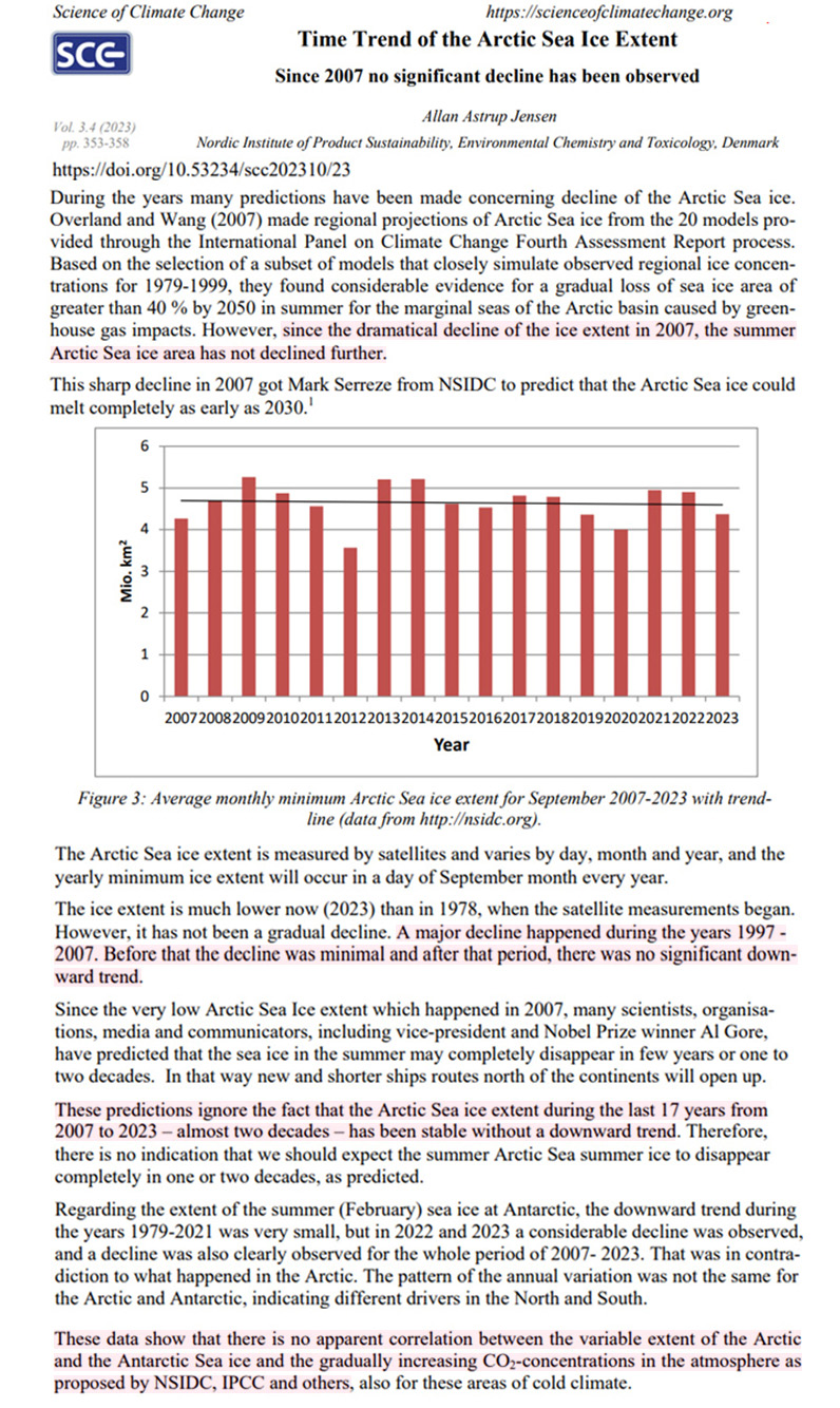
Image Source: Astrup Jensen, 2023
Featured Video

Argentina’s Javier Milei sells out his country for Israel
or go to
Aletho News Archives – Video-Images
From the Archives
Mutually Assured Delusion (MAD)
By Judith Curry | Climate Etc. | November 5, 2013
Groupthink: A pattern of thought charaterized by self-deception, forced manufacture of consent, and conformity to group values and ethics.
Groupthink: Collective Delusions in Organizations and Markets, by Roland Benabou, published in the Review of Economic Studies. Benabou also has a talk (ppt slides) on this subject.
First, a definition of groupthink (from the ppt slides):
Janis (1972)’s eight symptoms [of groupthink]:
- illusion of invulnerability
- collective rationalization
- belief in inherent morality
- stereotyped views of out-groups
- direct pressure on dissenters
- self-censorship
- illusion of unanimity
- self-appointed mind guards
Sound like any groups that we know? … continue
Blog Roll
 Aletho News
- Sudan’s RSF leaders build Dubai property empire with UAE backing: Investigative group
- West losing leadership position to Global South: Russia’s president
- How Cognitive Science Explains Our Looming Nuclear Crisis
- Have the US and Israel killed non-proliferation?
- Moscow, Tehran to support each other amid US aggression: Russia’s defense minister
- Iran says EU’s insistence on sanctions hastens its ‘embarrassing descent into irrelevance’
- Argentina’s Javier Milei sells out his country for Israel
- Putting Nukes in Finland Won’t Make Country Safer, Finnish Politician Cautions
- Ukrainian drone strike kills worker at Europe’s largest nuclear power plant
- What the West Hides About Soviet Role in De-Colonization
- If Americans Knew
- What ceasefire? Israel won’t stop killing in Gaza, Lebanon – Daily Update
- Palestinians in Gaza Want to Rebuild Food Systems. Israel Isn’t Letting Them.
- Under Trump, Green Card Seekers Face New Scrutiny for Views on Israel
- Sheep Theft Sent Shockwaves Through a Palestinian Village. Then, a 12-year-old Boy Was Shot Dead
- Trump alum helps Israel mount AI influence campaign
- Dispatches From Catastrophe
- Despite Denials, AIPAC Is Now Funding Campaign of Ala Stanford In Philadelphia
- Israel’s neighbors are irate about its treatment of religious sites
- Israel escalates in Gaza: killing, torture, hunger – Daily Update
- Six Months into Gaza Ceasefire, Setting the Record Straight About Aid
- No Tricks Zone
- New Study: Extreme Heat Records, Heatwaves, Extreme Cold Records Declining Across US Since 1899
- It’s The Cold, Stupid! Cold 20 Times More Lethal Than Heat, Multiple Studies Show
- European Institute For Climate And Energy: “Climate Debate is Seldom About Science”
- New Study: The Climate May Be 5 Times More Sensitive To Solar Forcing Than Commonly Assumed
- EV Industry Reached $70 Billion In Losses In 2024 Due To Delusional Green Ideologies
- Reality Check: Maldives Have Actually Grown In Size Or Remained Stable Over Recent Decades
- Abrupt Climate Change Also Occurred NATURALLY In The Past …25 Times During Last Ice Age
- Cave Discovery Reveals Today’s Desert Climates Were Recently Far Warmer, Wetter, Teeming With Life
- German Expert: Heat Dome Led To Record Temps In Western USA…Warmer In 1934, 1936
- New Study: No Linear Warming Or Glacier Retreat Along Northern Antarctic Peninsula Since 1980s
